
World Gold Council - Gold retail insights
Branding / UX / Website / Animation / Art direction / Campaign
Intro
World Gold Council is the market development of organisation for the gold industry. Their purpose is to stimulate and sustain demand for gold, provide industry leadership, and be the gold authority on the global market.
Insight
World Gold Council were looking for a more engaging way of presenting their insights report online across multiple markets, one that would strike the balance between the articulation in the data and presenting an inviting narrative.
Idea
Create an experience that sets the benchmark for future World Gold Council communications both from a visual and responsive standpoint. Engaging old and new audiences as a resource guide for the future. Telling a clear story from survey performed by Hall & Partners, presenting the view of 18,000 people across India, China, the US, Germany, Canada and Russia.
My responsibilities
As the Experience Designer, I collaborated with the Data Journalist, Content writer, Data Visualisation Designer and Web Developer to visualise the story we wanted to tell. I helped;
Conduct series of face-to-face client liaison workshop/meeting from kick off to final output of the project
Defined objectives of the story to develop perceptions around gold and influence investors
Create the creative direction, style tile, wireframe, high fidelity design and art directed animation
Meeting the client & understanding their challenges

Conducting a collaborative workshop
After an initial call with World Gold Council, they were one too many themes they felt quite strong about. Conducting a collaborative workshop along with Hall & Partners helped identify the key audience persona and defined the higher level content structure of the state of gold consumer report. I believe it’s a good approach to get the client involved in workshops, it cements the trust and ultimately builds awareness of any considerations through out the project.
The next steps involved presenting back an outcome report of the workshop to World Gold Council. This helped communicate the distillation of the audience and reach a proposed content outline together that informed the ideation, sketching of design sections and user experience for the interactive story.
User personas activity
I identified where the audience groups have overlapping characteristics that can help ensure that the core user journey maintains a good balance of informative content for the different personas.
Defined the broad audience roles
Identified key sub-audiences
Defined the job roles the audiences have
Listed the main jobs and pains for the different audience groups
Audience groups
Investors
Trade
Media
Mining companies


User persona
I created a report from the workshop session conducted on user personas uncovered. Communicating clearly insights from discussions with World Gold Council and Hall & Partners.


Insights discovery activity
Along with the team, we assisted World Gold Council and Hall & Partners in identifying the key insights that will make it into the interactive story. These insights were tailored and prioritised for each of the audience groups.
Laid out the key insights from the report
Selected insights relevant to each audience
Assigned each insight a priority score
Insights group
Three main insight group identified:
State of the Market
Drivers of Demand
Concerns and Opportunities


Objective
provide a global perspective of gold across retail investment and jewellery.
Elegant meets social modernism.
A clean, minimal elegant backdrop of Gold Council’s branding brings opportunity to juxtapose modern, welcoming fluorescent colour to breathe fresh life into the brand whilst subtly presenting change that reflects the fast moving and evolving marketplace.
Data visualisation for all.
Dial up each highlight through clear visual depictions, using shape, size, density or colour the visualisations will be carefully crafted to marry up with the message. Presenting the key insights through subtle visuals that reflect the story whilst being built up by the very dots that present the data. These visuals will morph in a subtle motion to express the evolving landscape.
a Connected user journey.
Deep dive into insights, editorial layout weaved into experience and dynamic graph representation ensuring the user receives a cohesive message through owned, earned and paid media. Honing in on the design principle - relationship, layering and navigation.
Story board & sketching
Working with the Data Journalist and Data Visualisation Designer, I have taken some of the key insights identified from the collaborative workshop. Scamping out ideas to effectively communicate the vision for the project. I find this process a good litmus test with the client.
Title treatment
Using the three rings visual motif from World Gold Council brand depicting three moments in time — the past, the present and the future. Reinforcing World Gold Council as a balanced, modern, and forward thinking organisation.
Hero content & Navigation
Working up intro’s into hero content and how the branding is echoed through the navigational elements and key interactions.
Pull stats & Data viz
A combination of pull stats and data viz to cater for different layers of information from the insights.
Creative direction
Transition
Design Principles - Relationship. Layering. Navigation.
A key take away for the different personas is explanation and exploration. Creating a sense of data exploration highlighting overlaps and how the insights complement each other. Deep dive into insights, editorial layout weaved into experience and dynamic graph representation
Relationship
Layering
Navigation
Style tile
I have used this style tile below to communicate to the client how their brand will be visualised within their product. All of which form a clear, cohesive visual language to be constantly simplified and carried through to final output.
Section markers
Icons
Video block
Data viz
Photography treatment
Content & Wireframe
Once the team and client were happy with the direction, I progressed to turning the content outline to wireframes. Wireframing is useful for obtaining an initial visual understanding of all the moving parts of the project and helps showcase the structure to the client.
Initial sketches


Early Wireframe






High fidelity design
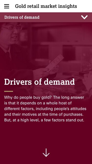
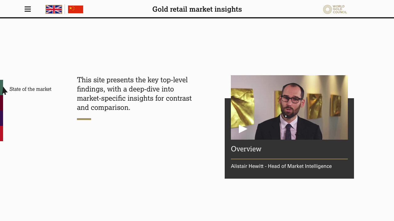
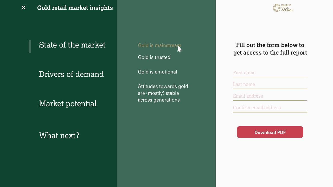
Great interaction design feel effortless to users. They omit unnecessary elements and use straightforward language. The best way to attain simplicity is through thoughtful reduction. Thus, we tried to achieve it by discussing every screen during our weekly calls and iterating until everyone was satisfied with the outcome.
Mobile




Desktop & Tablet




Design system & Development
To get the right level of guidance from design, I have created symbol components in Sketch of the different UX elements that would help aid understanding of the states and journey in this product. I use Zeplin app to help me communicate effectively to the developers through the rest of the project in real time. It pings synced update via slack channels created for the project, so we are all up to date with the progress and managing feedbacks.


Prototype
Creating quick prototypes to communicate the vision of the experience makes it easier to get sign-offs, considering we still have to build the Chinese translation site to go live with the social campaign.
Social campaign
Sequential messaging
We recommend a “Catch, Connect, Close” approach in order to bring breadth and longevity to messaging.
I gave art direction for the Datagrams to the animator to help unify the creative vision across the Datacards, Infographics and overall site experience.
Datagram 1
Datacard 1
Datagram 2
Datacard 2
Datagram 3
Datacard 3
Infographic
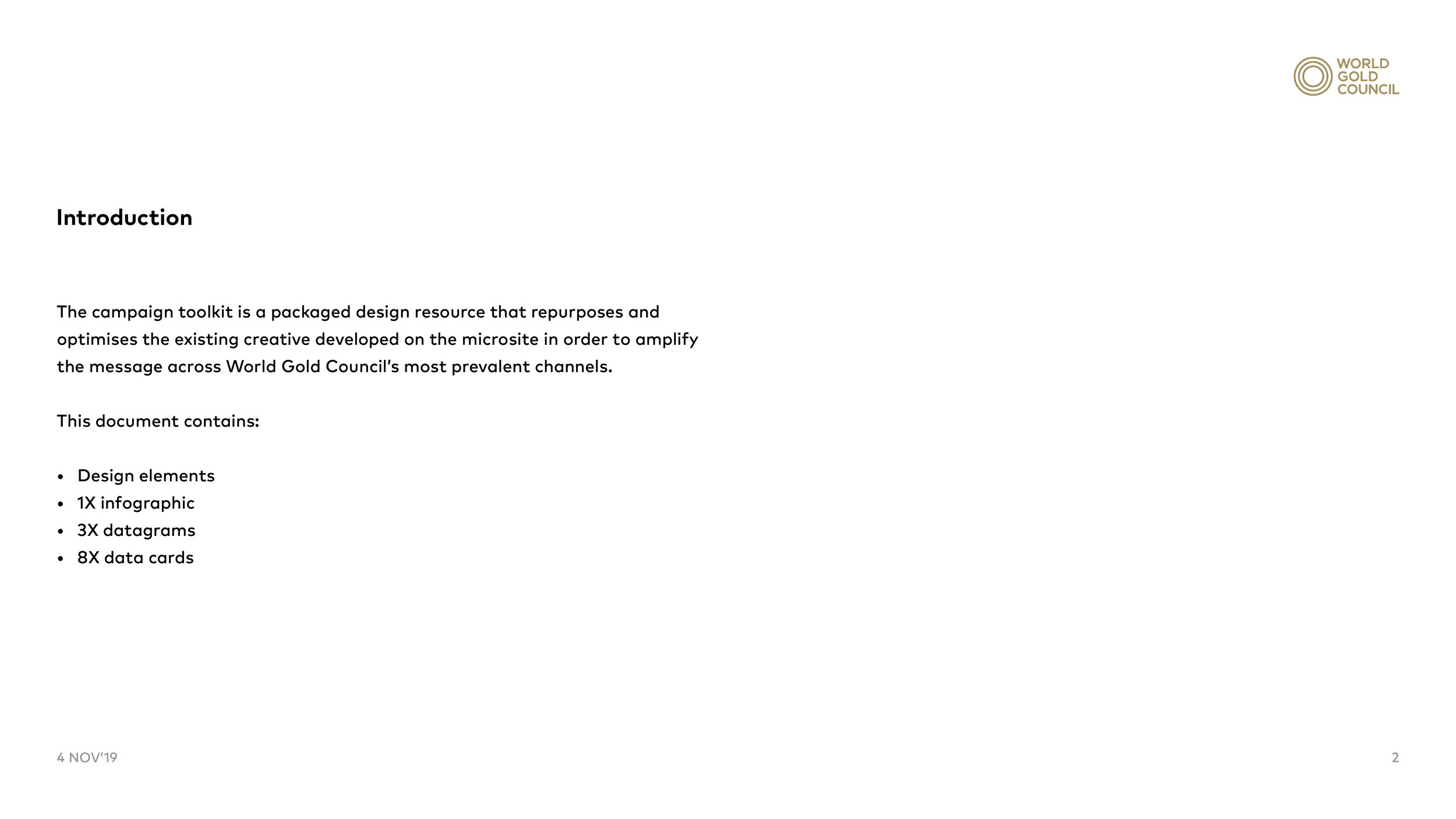
Campaign toolkit
I put a design guide together that will allow World Gold Council to translate the creative into usable design elements for use as campaign assets.



Quality assurance &… launch!
Through the iterative development of the site experience, we embedded eureka moments that allows the user to interact with gestures such as toggles for data exploration, highlighting overlaps and how the insights complement each other. Deep dive into insights, editorial layout weaved into experience and dynamic graph representation, whilst defining a clear sign post for each section.


