Jobsite - Lost in translation
Branding / UX / Website / Animation
Intro
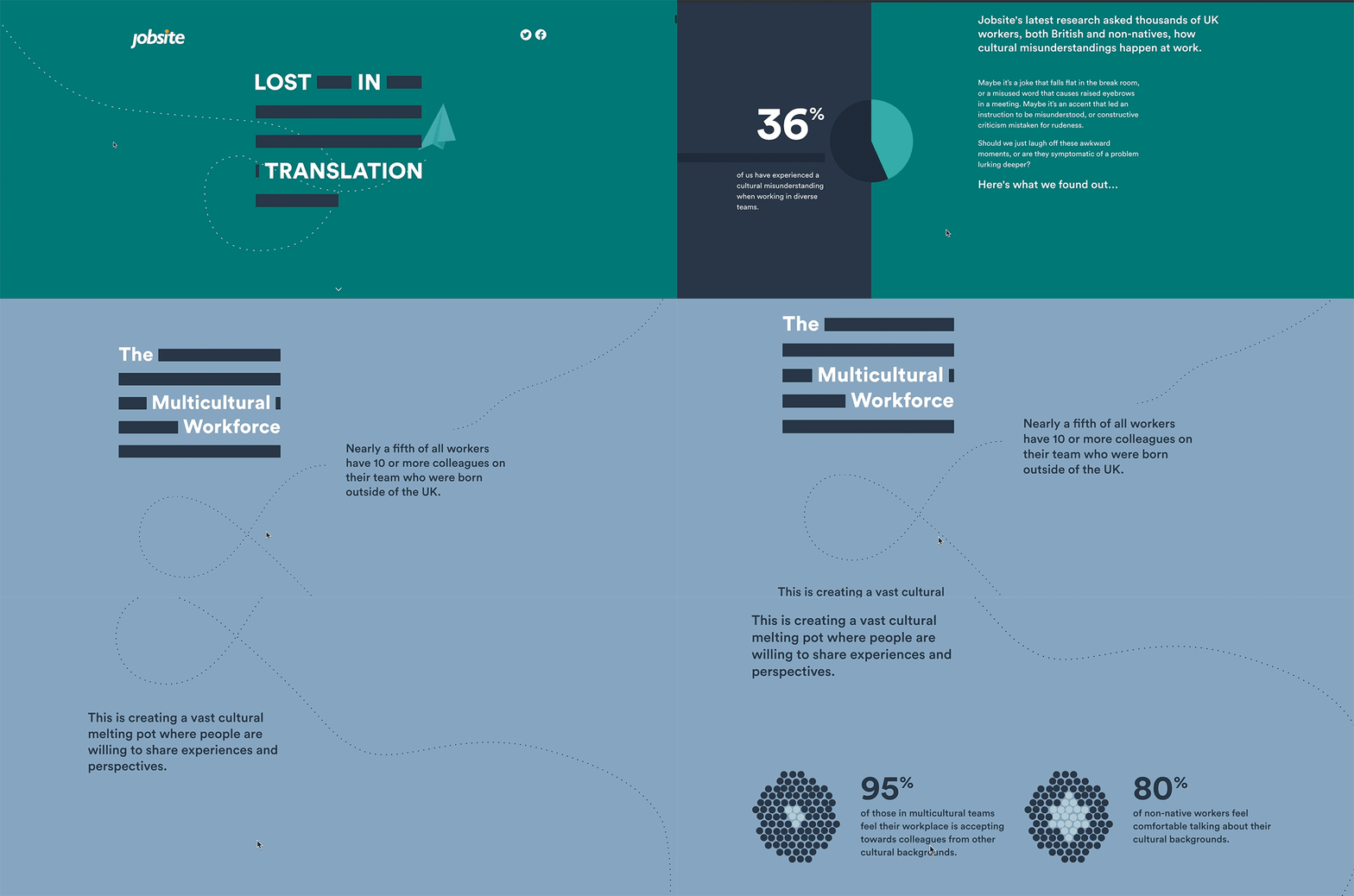
Jobsite is one of UK’s leading job board, they regularly present in-depth stories which speak to a candidate audience and gathers attention from reputable media news sites. Jobsite's latest research asked thousands of UK workers, both British and non-natives, how cultural misunderstandings happen at work.
Insight
Despite the capital of the UK is regarded as one of the most cosmopolitan city, cultural clash still exists in our workplace. Opinuim conducted a survey that highlights interesting perspective into why, and how miscommunication is perceived in a cultural diverse team.
Idea
Create a scrollable story experience that explores key findings of survey conducted using visual metaphors to showcase the cultural miscommunications that can occur within the workplace and benefits of working in a cultural diverse team.
My responsibilities
As the Experience Designer, I collaborated with the Data Journalist, Content writer, Information Designer and Web Developer to visualise the story we wanted to tell. I helped;
Conduct series of face-to-face client liaison workshop/meeting from kick off to final output of the project
Defined objectives of the story to change behaviour, raise empathy, inspire and enlighten
Create the creative direction, style tile, wireframe, high fidelity design and animation
Objective
Diversity is good for business.
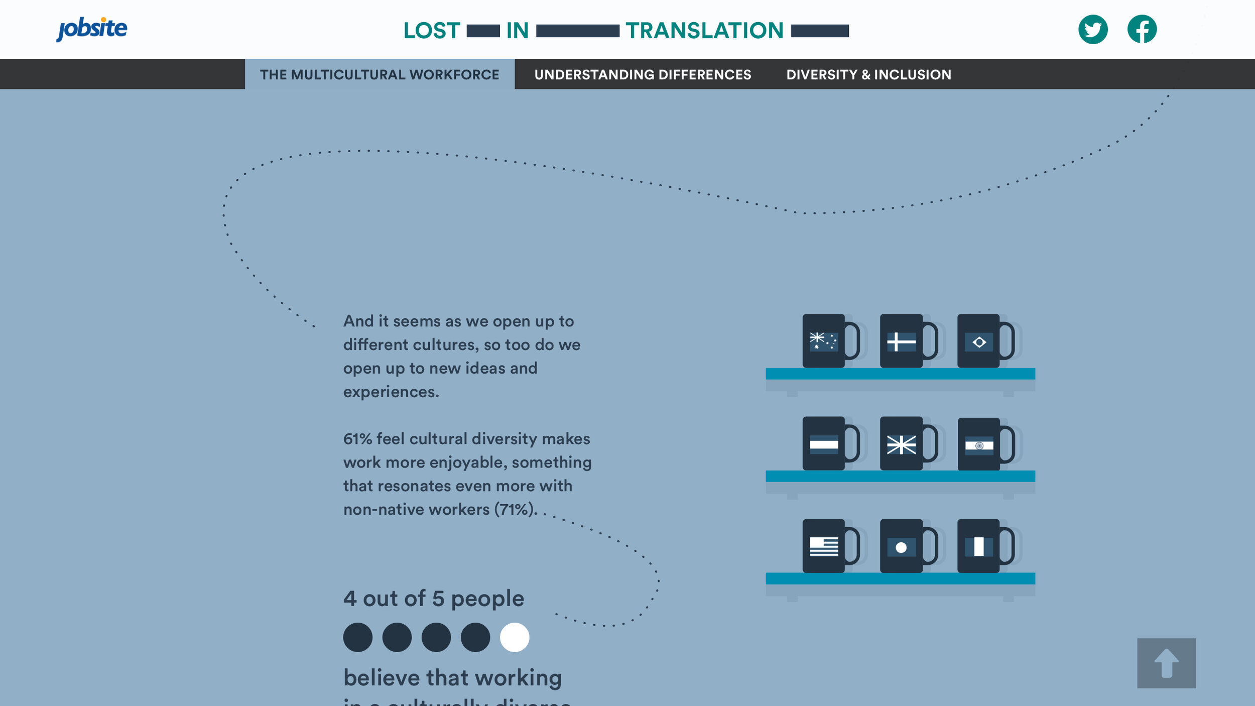
culturally diverse workplace teaches US new things.
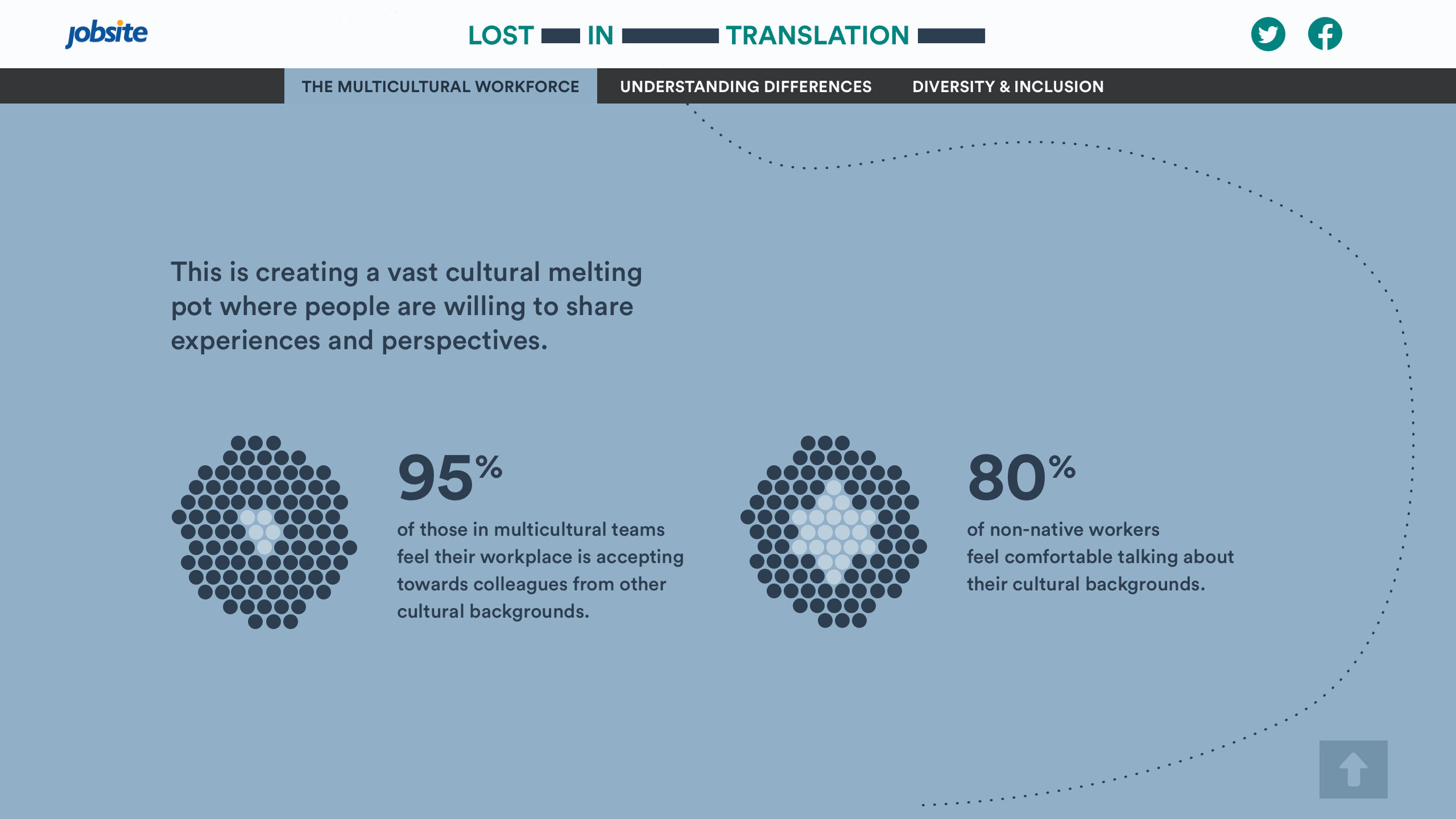
This is creating a vast cultural melting pot where people are willing to share experiences and perspectives.
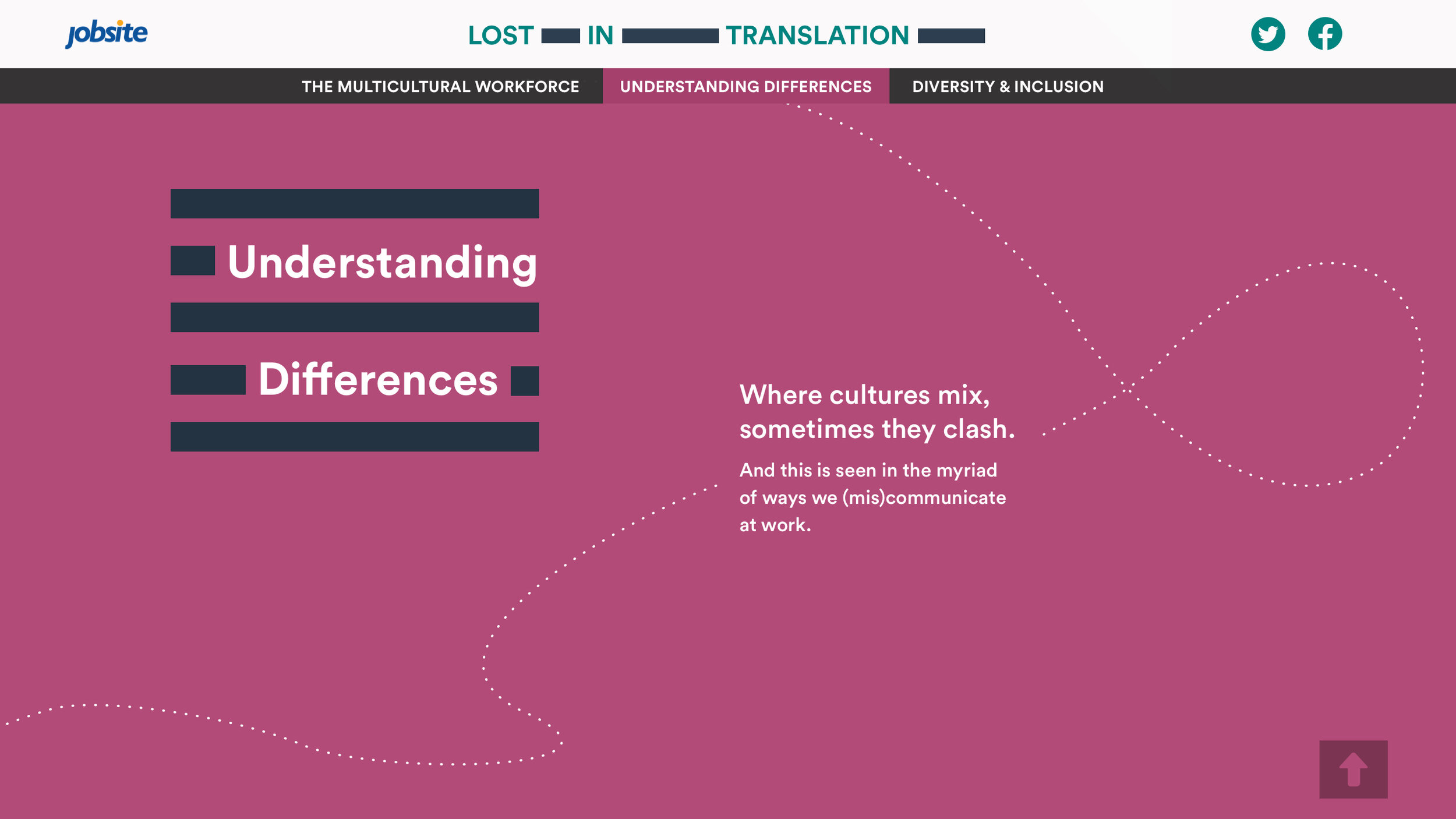
Where cultures mix, sometimes they clash or dance.
And this is seen in the myriad of ways we (mis)communicate at work.
Multiculturalism is a reality in our workplaces today.
But inclusion is an action.
Story board & sketching
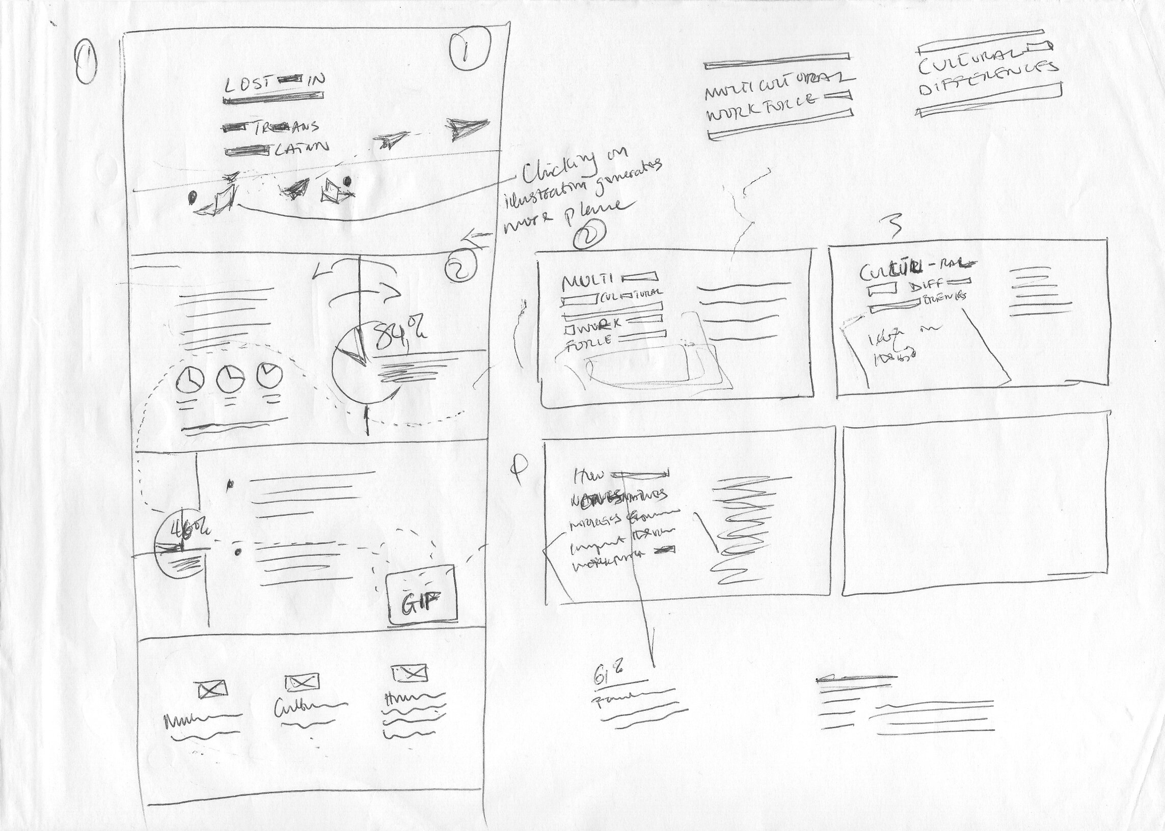
Working with the Data Journalist and copy writer, I have taken some of the key insights from the survey conducted by Opinium. Scamping out ideas to effectively communicate the vision for the project. I find this process a good litmus test with the client.
Title treatment
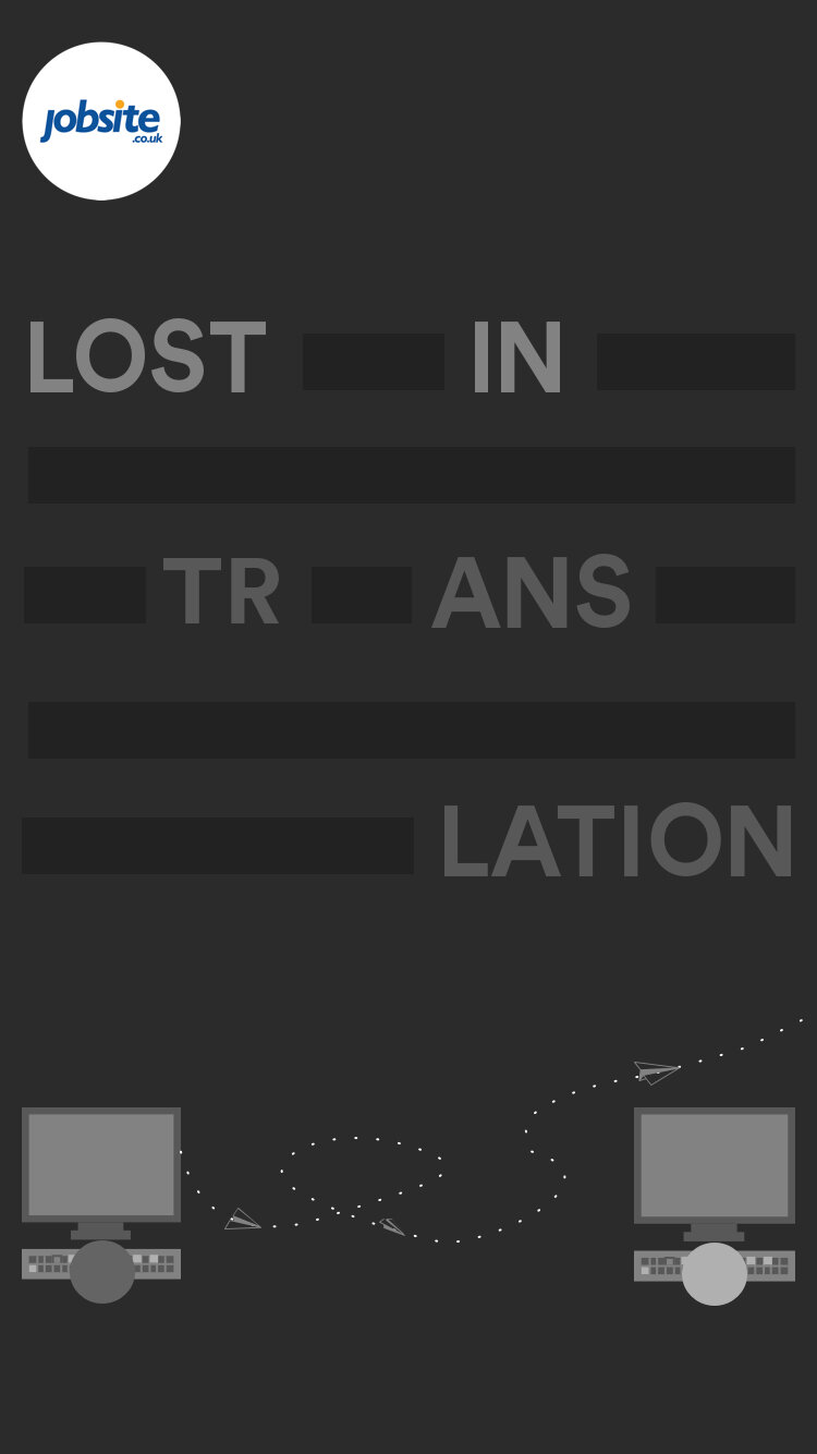
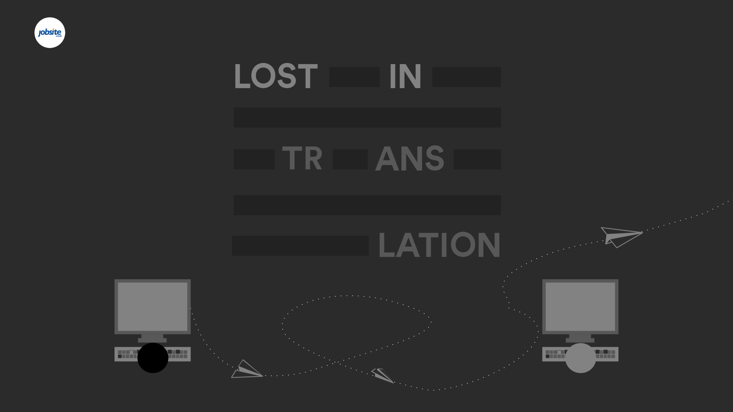
Using a visual representation of scribble text and play on words as visual metaphor. To support the connotation of the visual representation, I have used a typical scenario of when a colleague sends a message and it goes over their head.
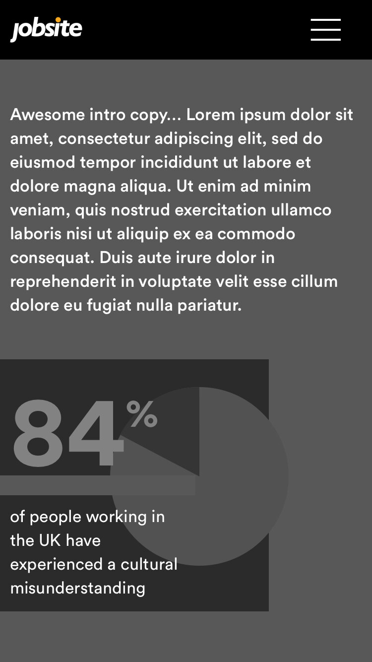
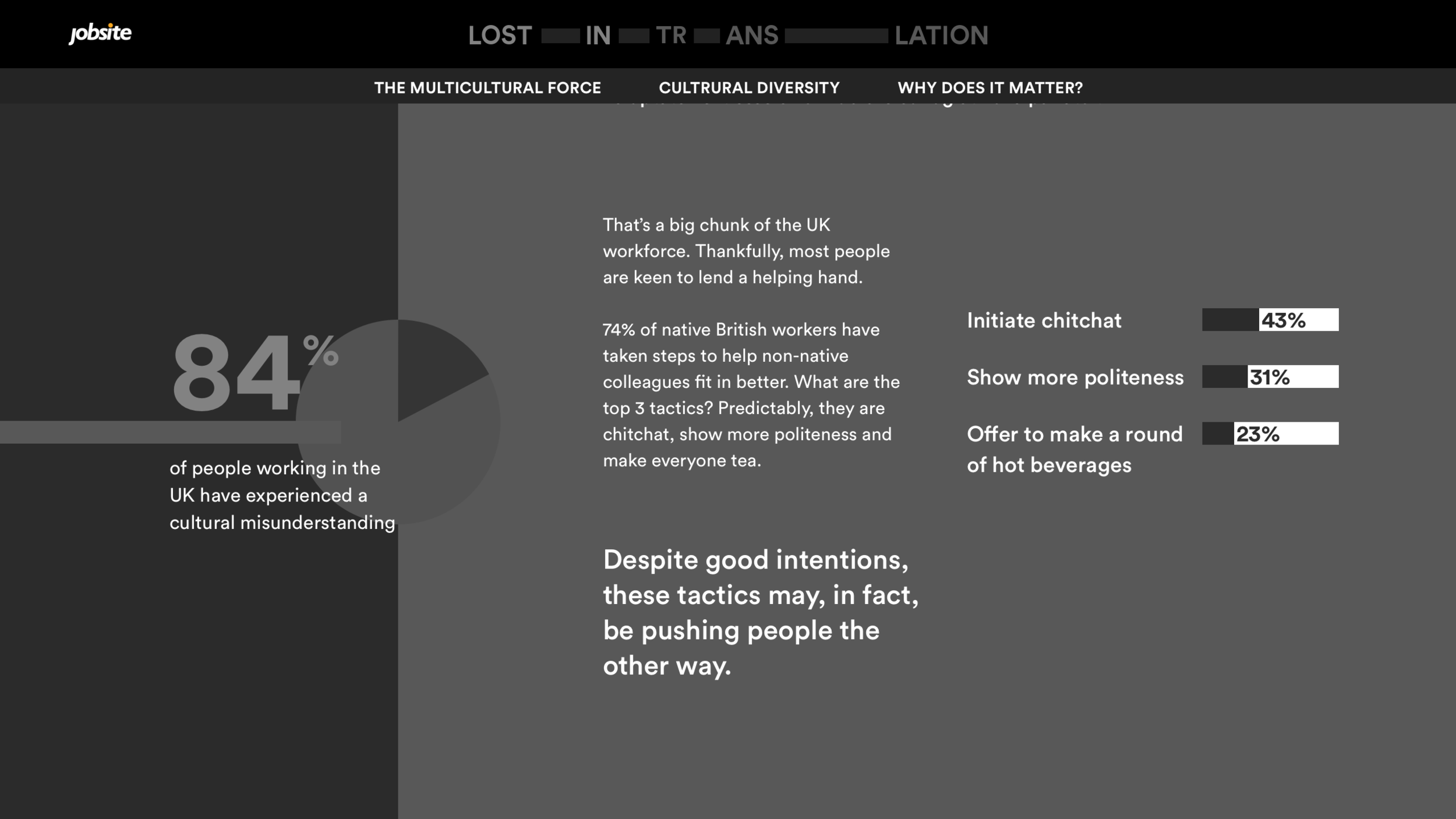
84% experience a cultural misunderstanding
Drawing on everyday conversations within a workplace. This illustrates a conversation in a team, with fast responses and emoji’s this then leads the animation of typing bubbles from one user. This ties into the idea of a user thinking or not understanding the conversation.
“Working in a diverse team makes it..”
We see the paper plane interacting with the gauge, nudging this to a more positive angle.
Creative direction
Bold. Playful. Editorial.
I defined the creative direction to help express the output vision clearly to the team and mange the clients expectations.
Bold
Use of bold colour combinations, allowing key data points to stand out.
Playful
Relaxed/cheeky tone of voice, use of animated metaphors to create an original theme, upon which the story can be told.
Editorial
Consistent visual devices that the user follows throughout the story to reflect the essence of the subject and make the experience more memorable.
Style tile
I have used this style tile below to communicate to the client how their brand will be visualised within their product. All of which form a clear, cohesive visual language to be constantly simplified and carried through to final output.
Branding Title
Bold recipe
Content & Wireframe
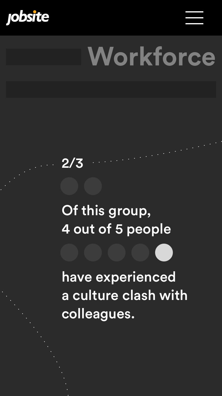
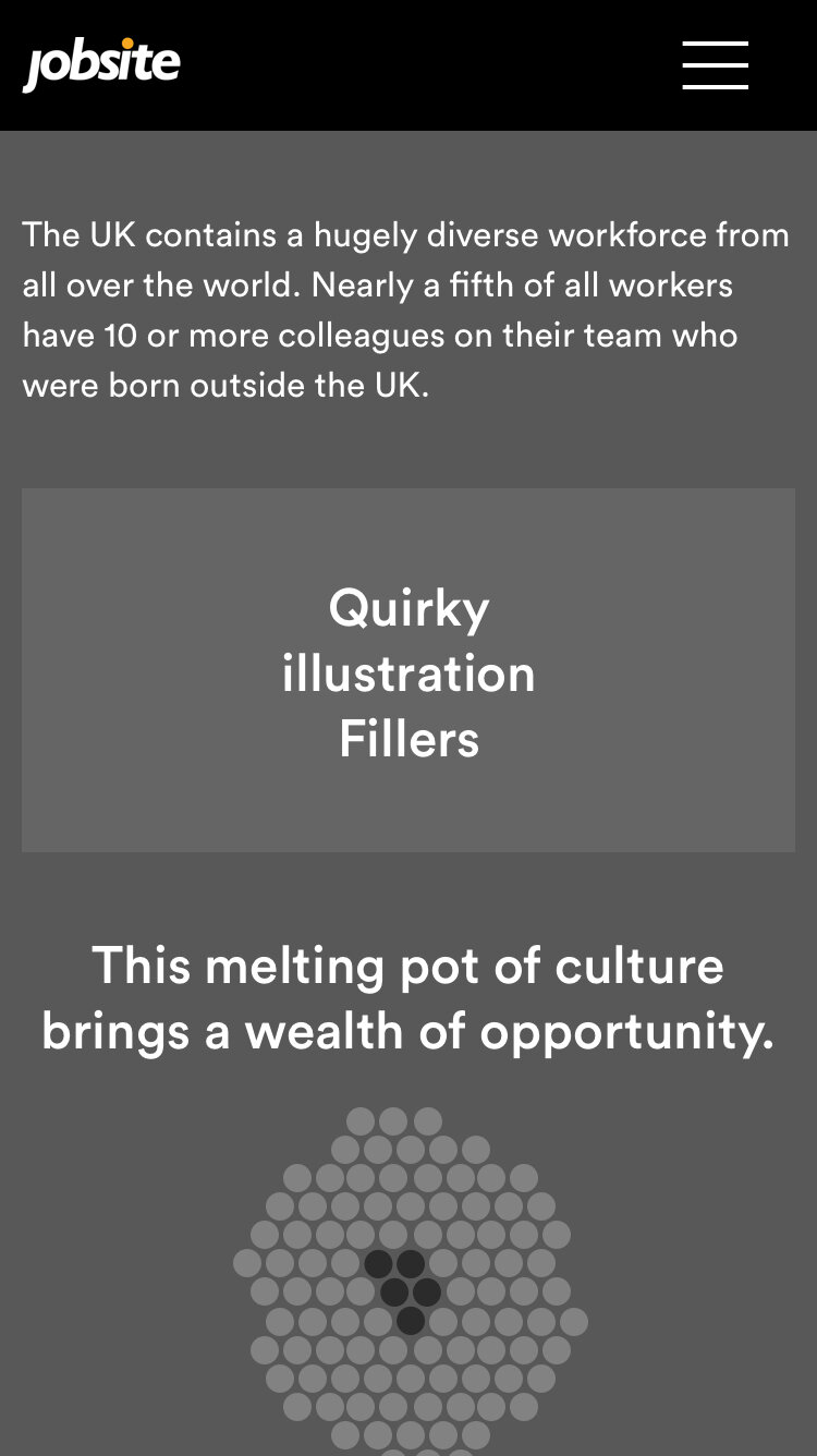
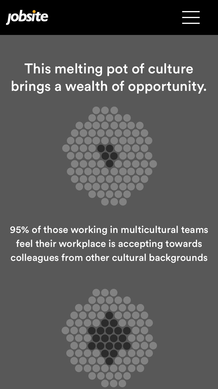
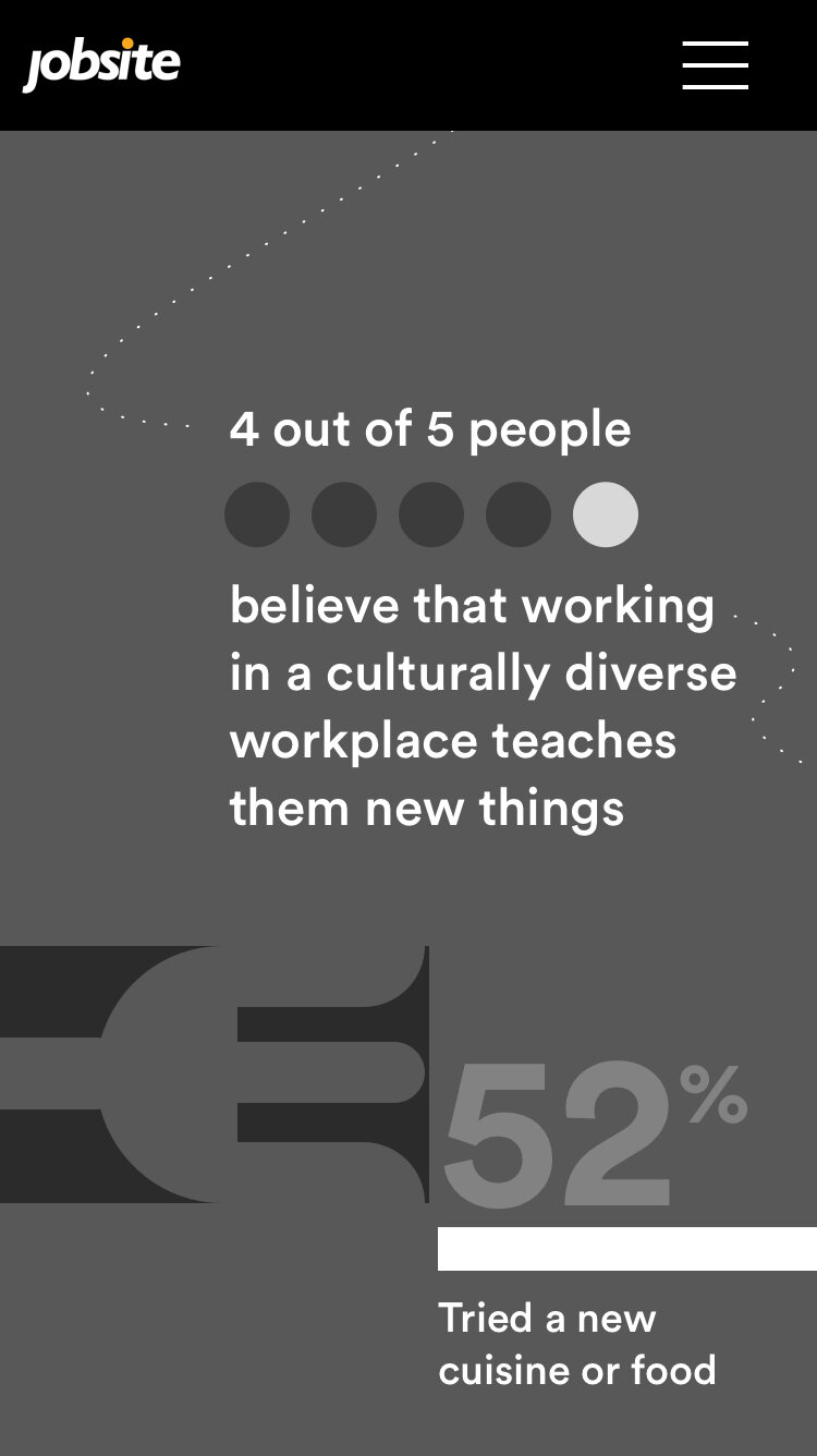
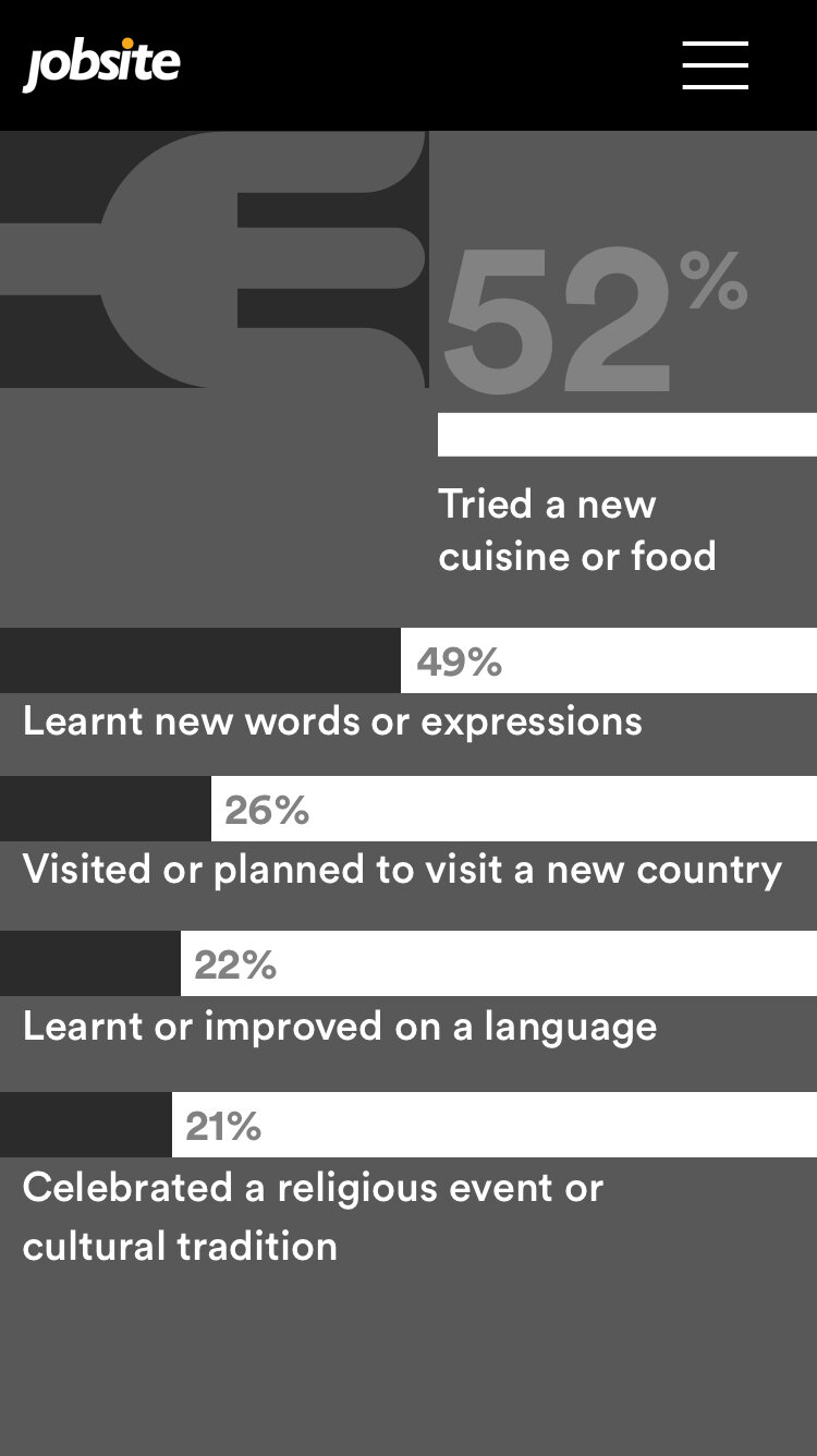
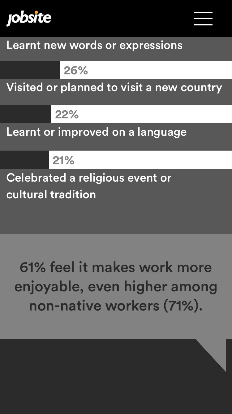
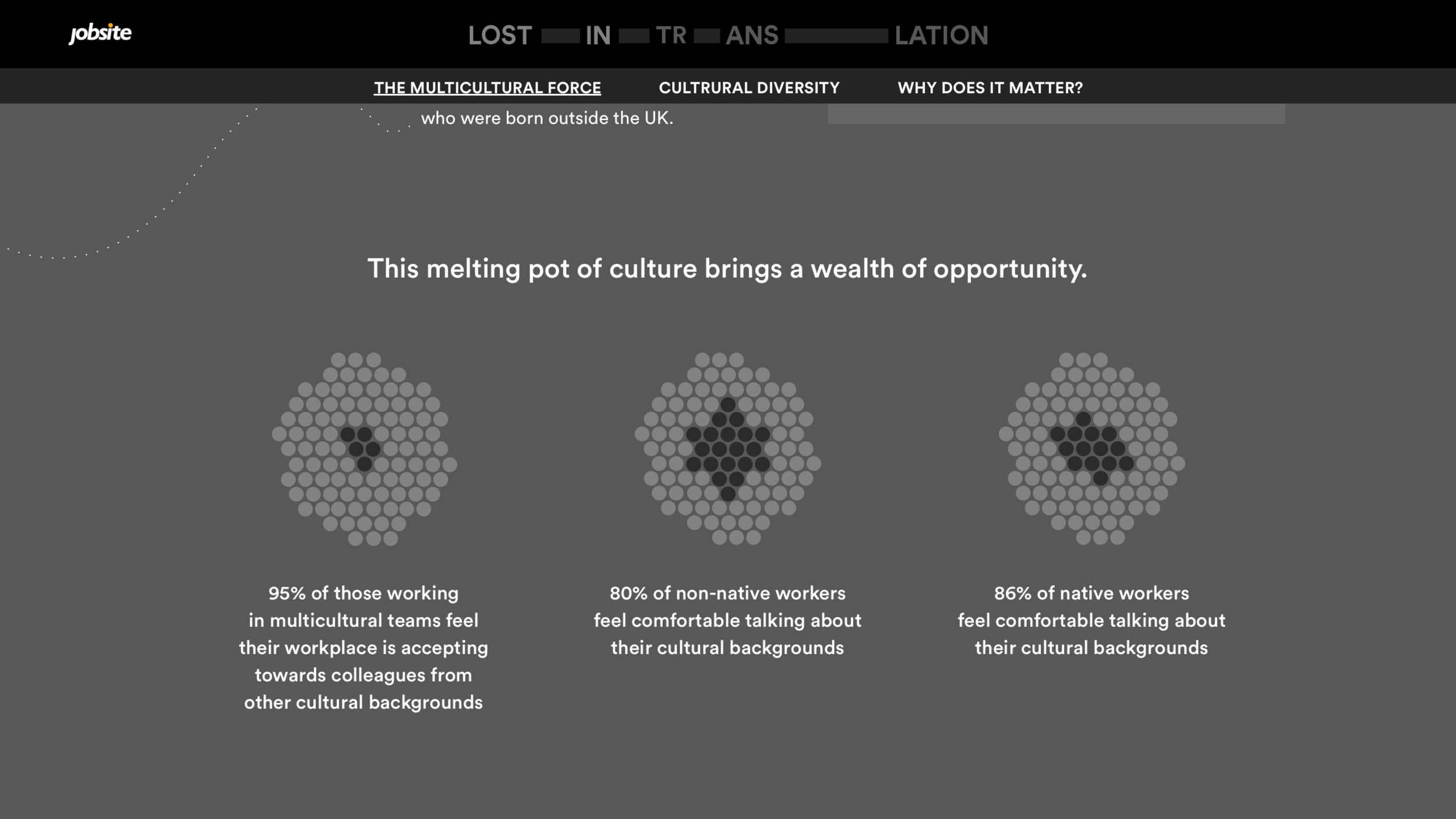
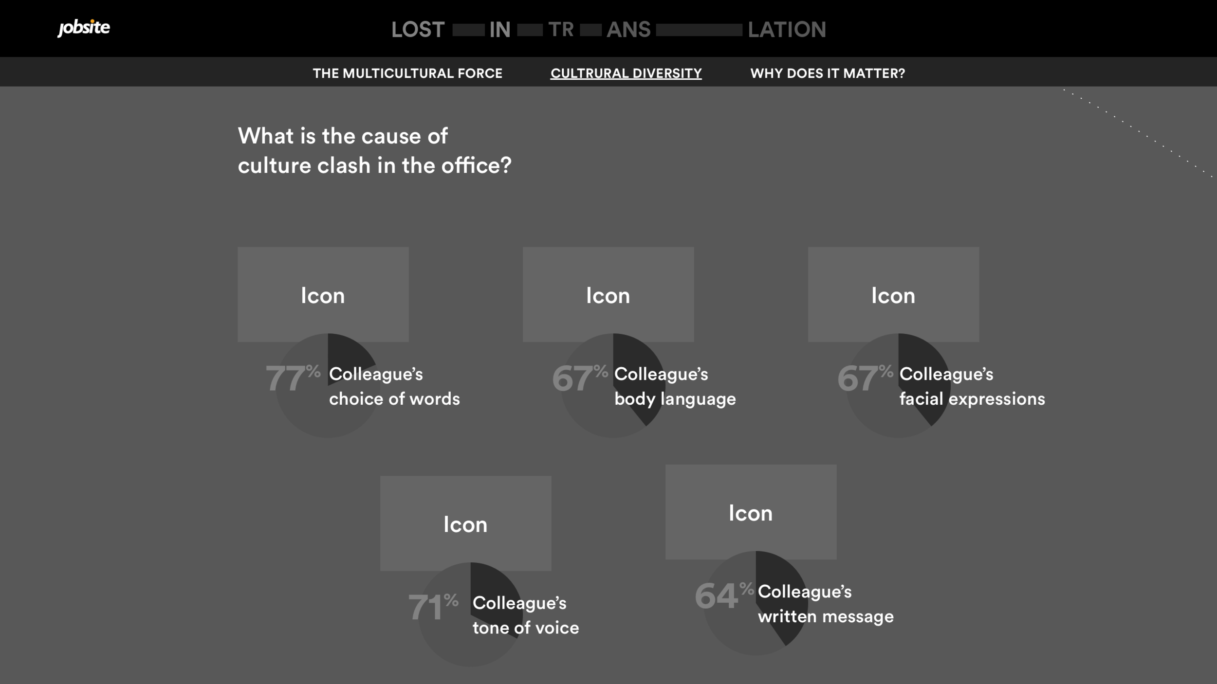
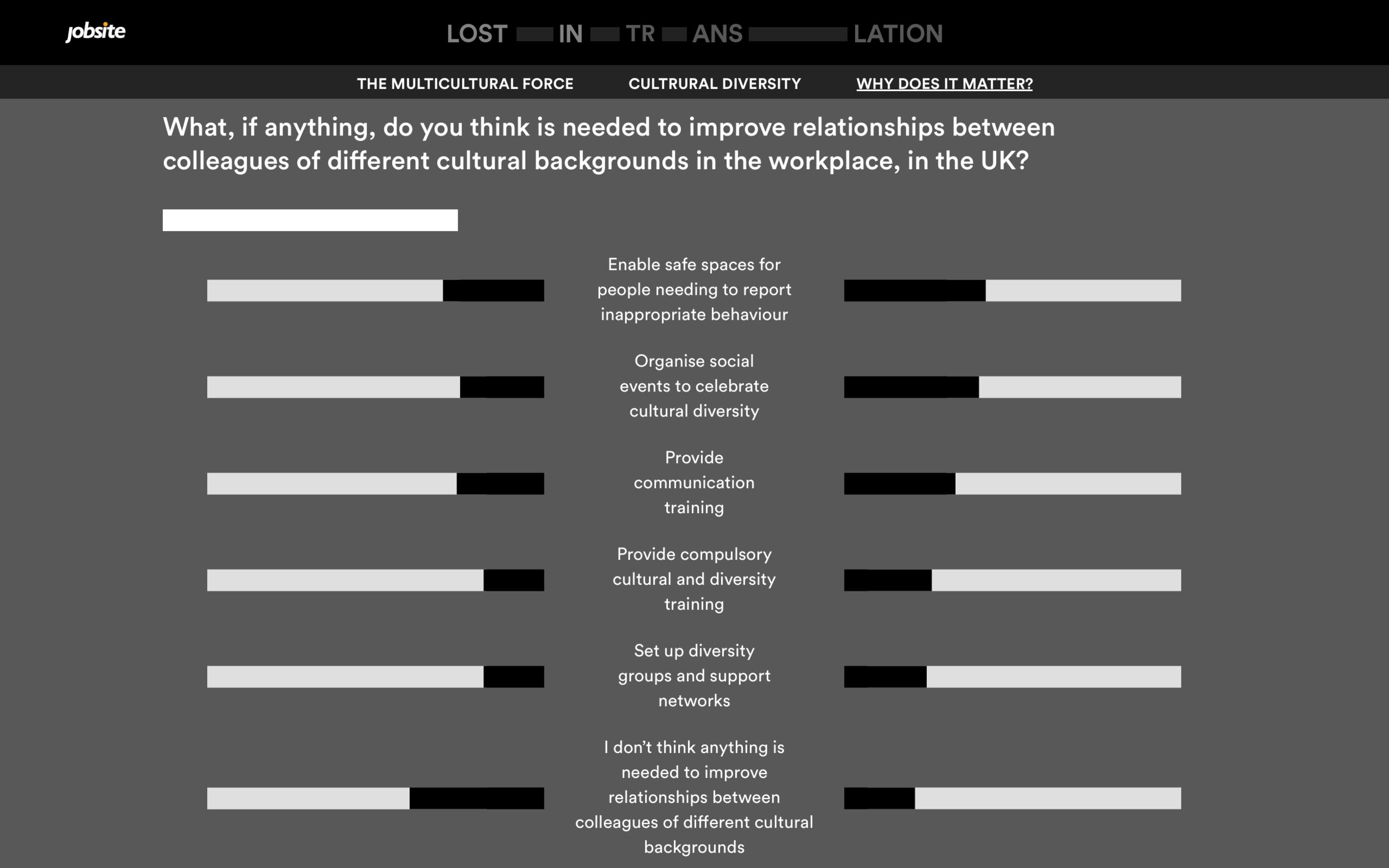
Once the team and client were happy with the direction, I progressed to turning the content outline to wireframes. Wireframing is useful for obtaining an initial visual understanding of all the moving parts of the project and helps showcase the structure to the client.
Mobile
Desktop


High fidelity design
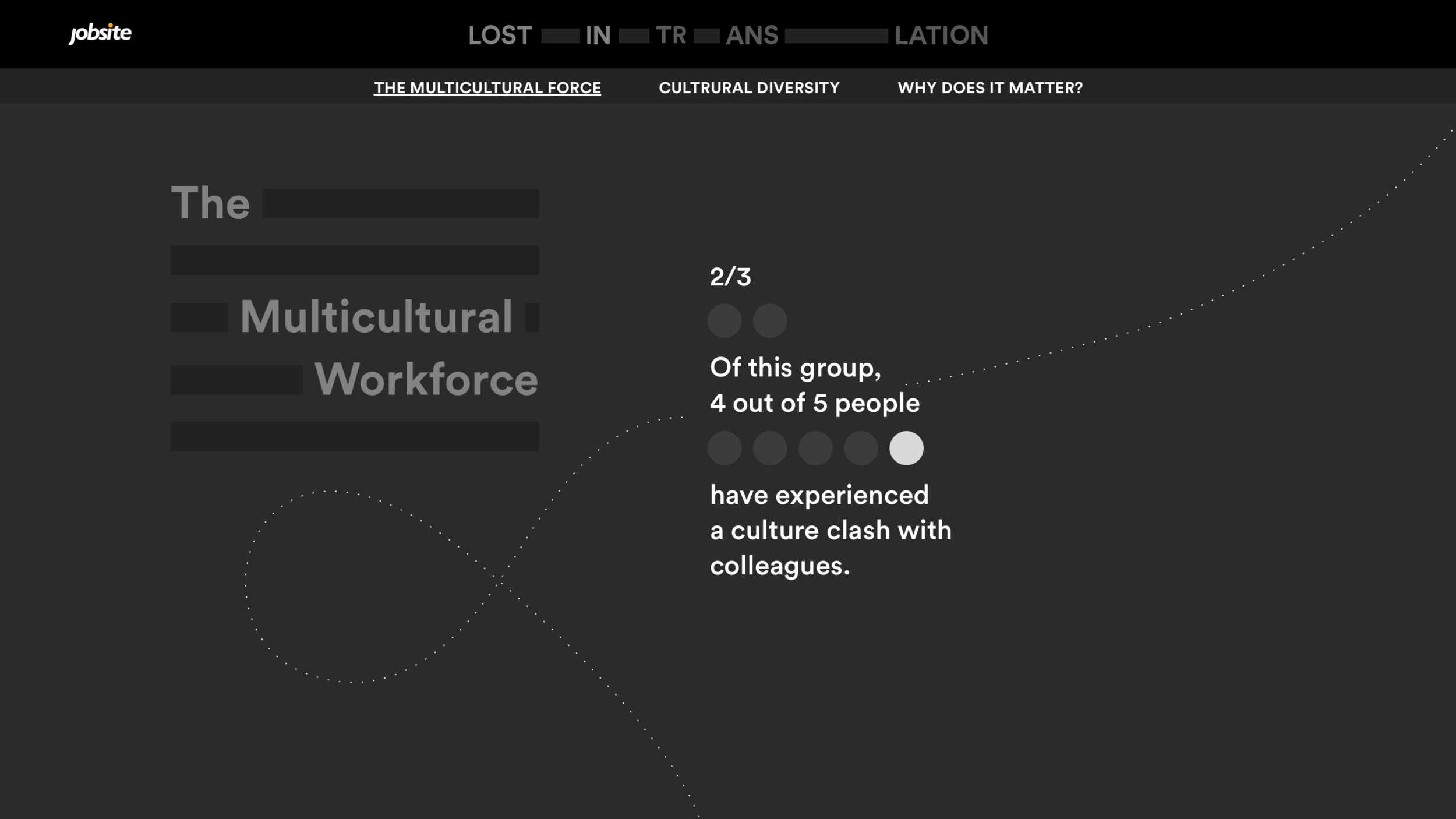
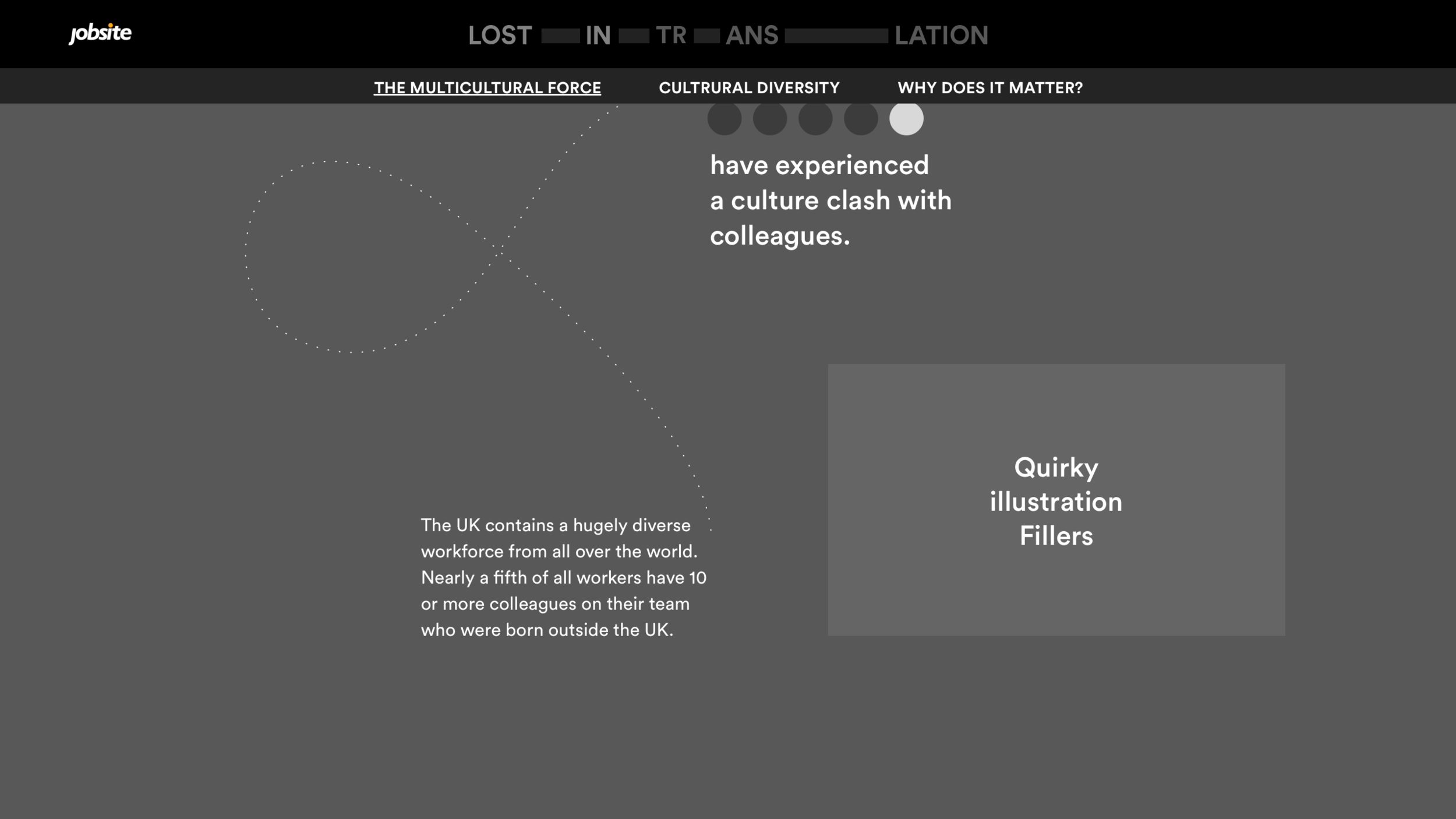
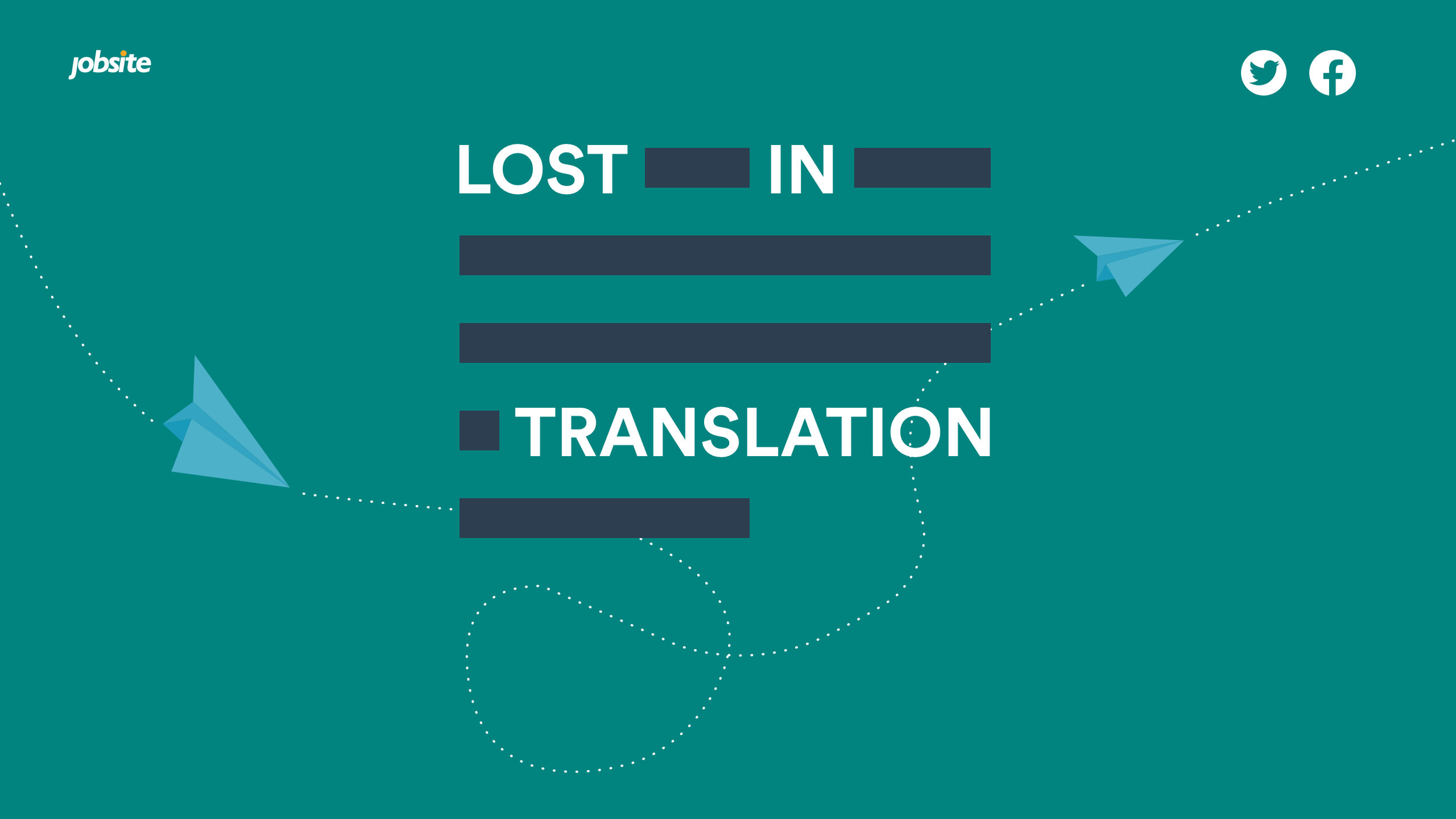
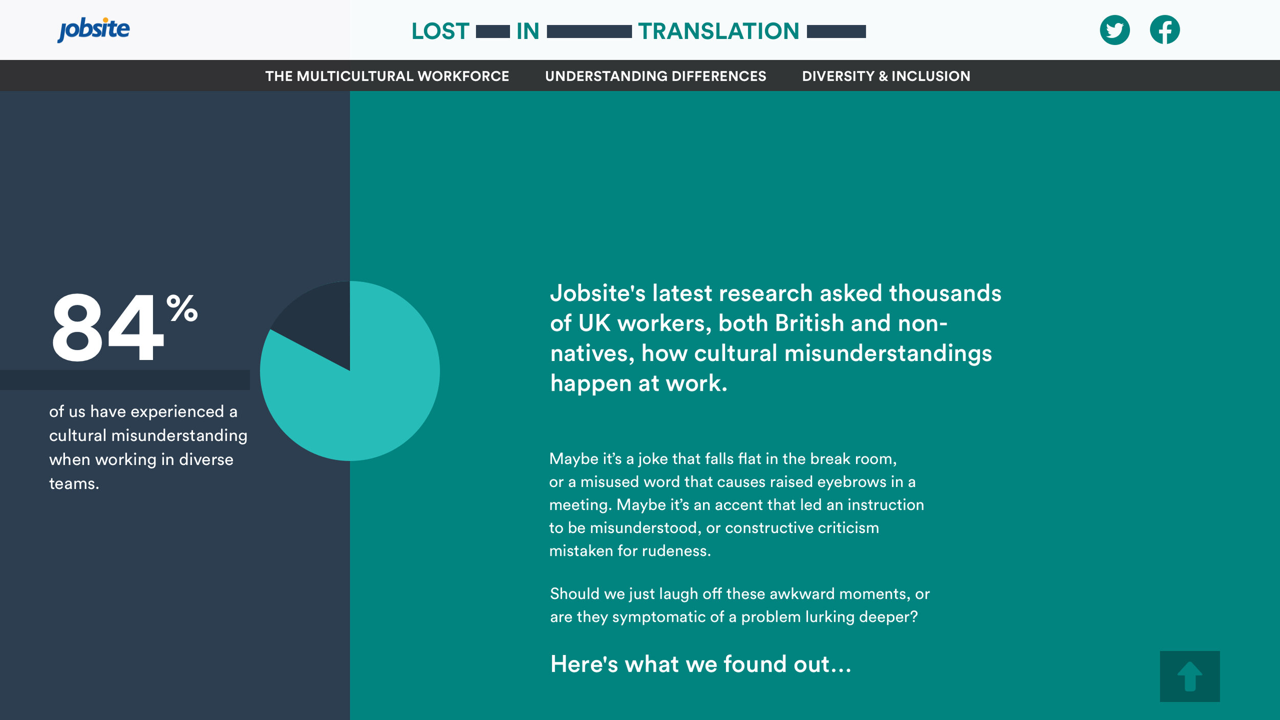
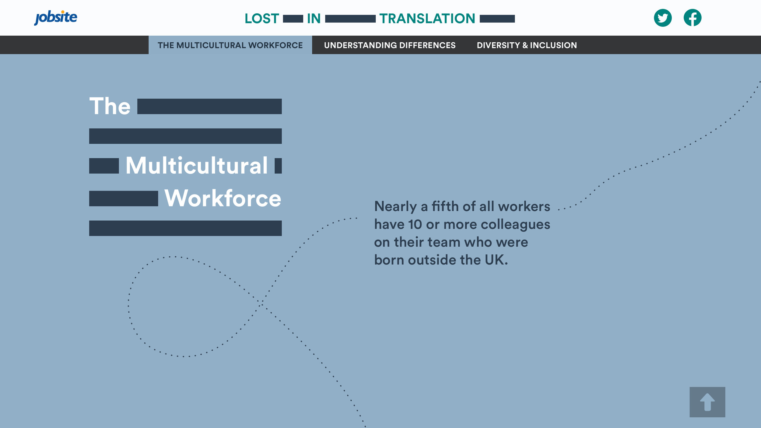
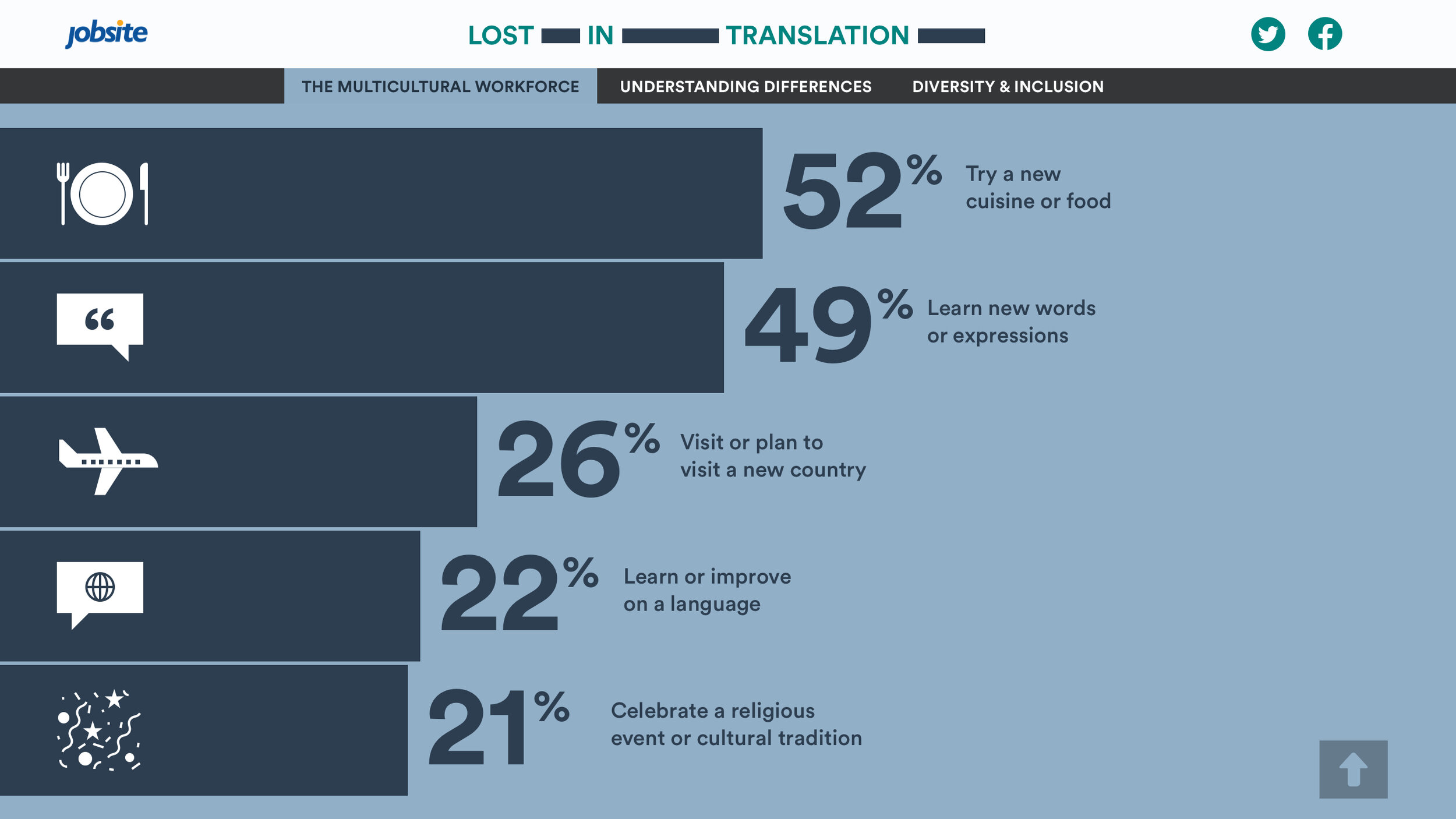
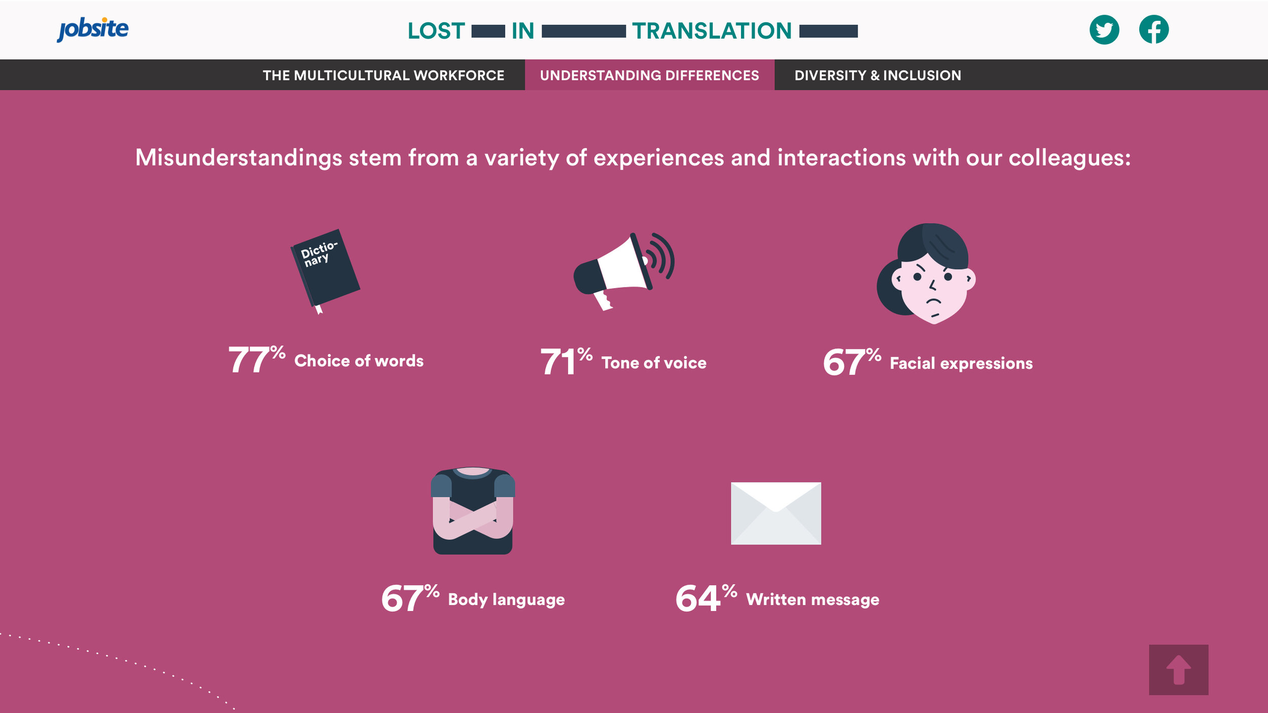
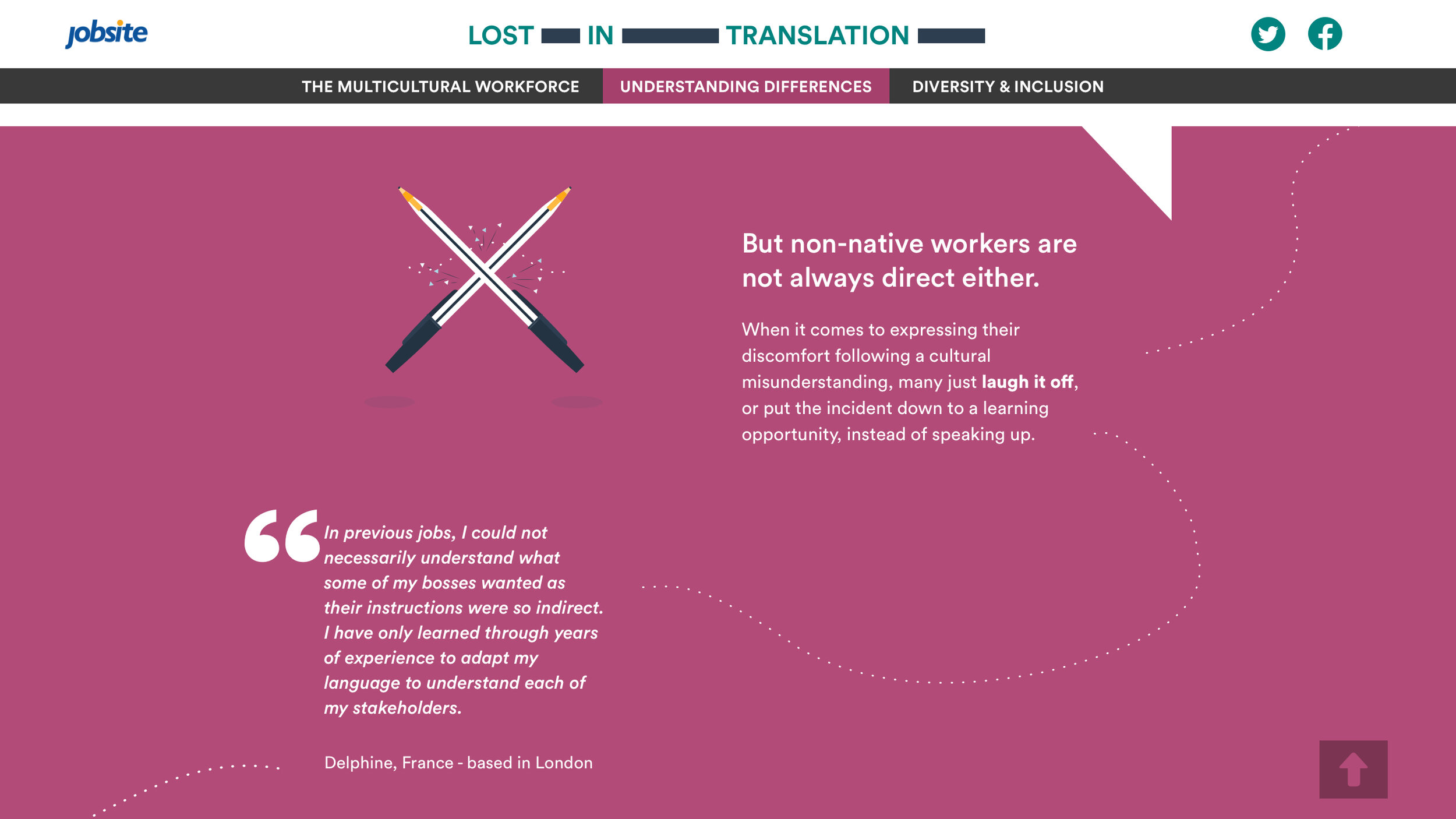
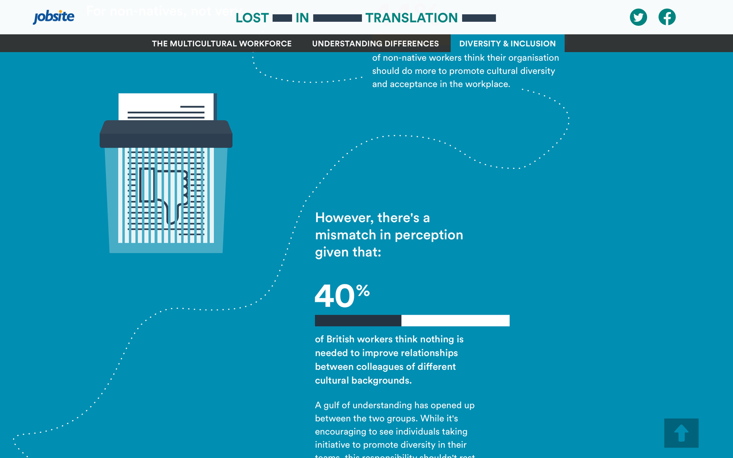
Great interaction design feel effortless to users. They omit unnecessary elements and use straightforward language. The best way to attain simplicity is through thoughtful reduction. Thus, we tried to achieve it by discussing every screen during our weekly calls and iterating until everyone was satisfied with the outcome.

Design system & Development
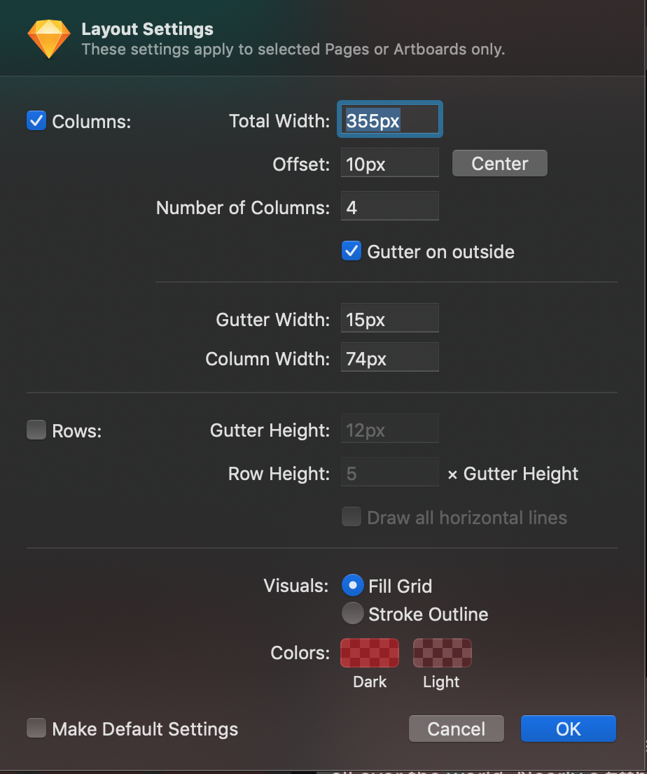
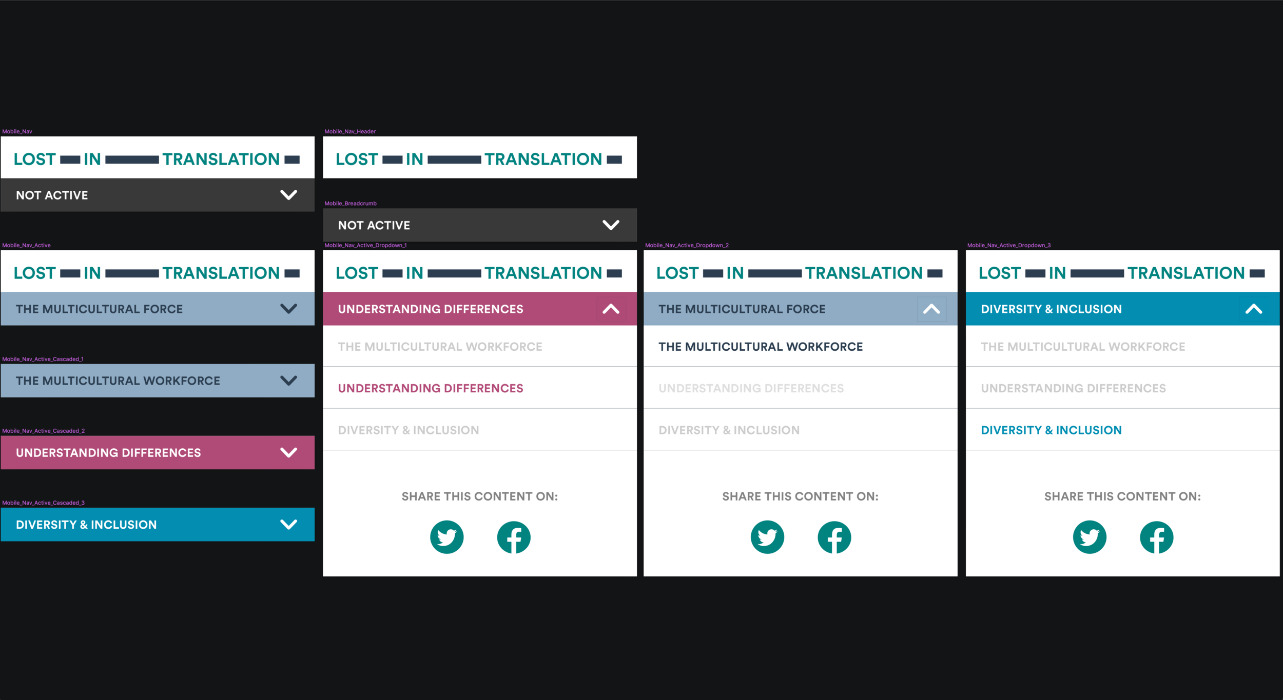
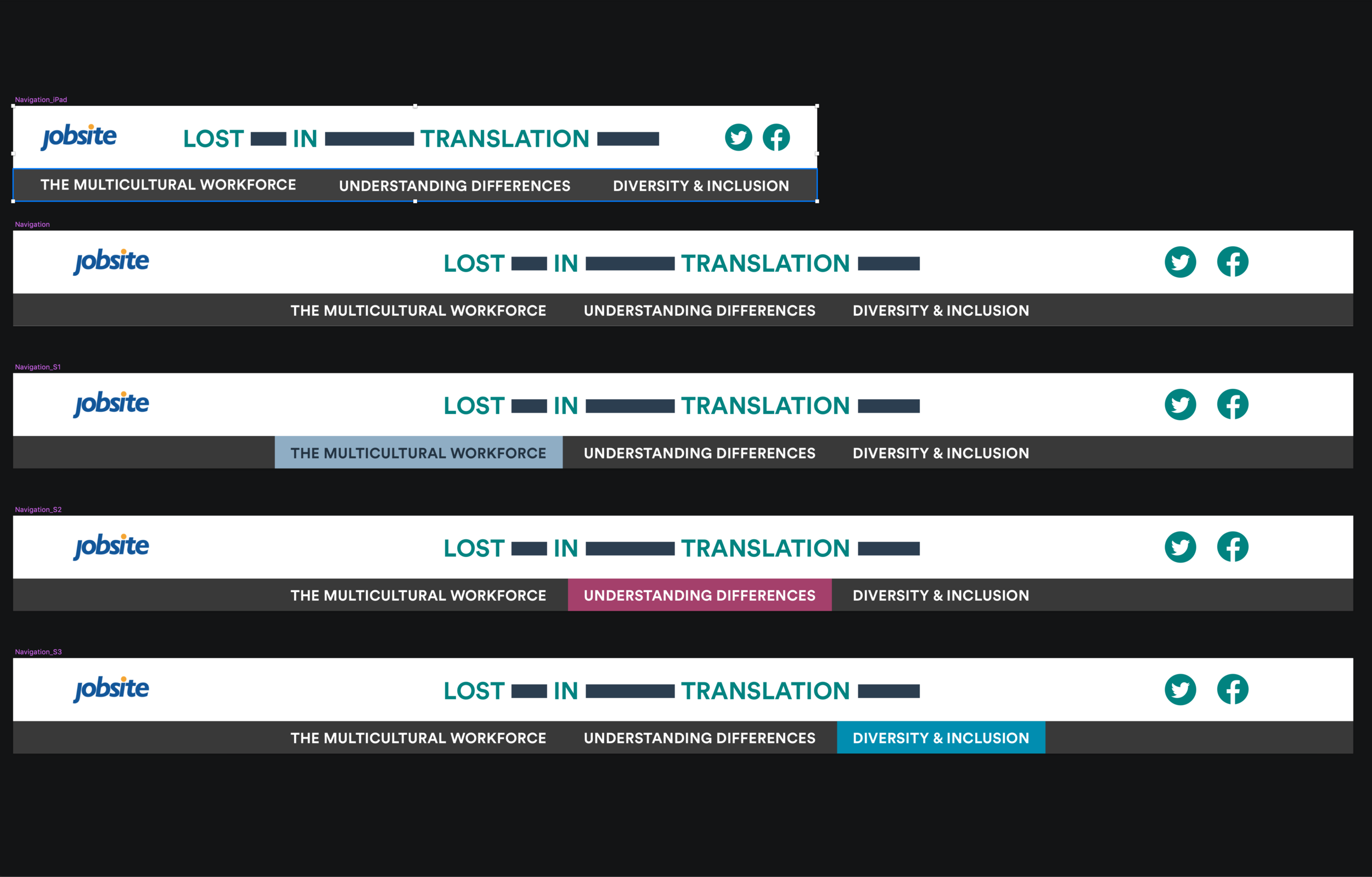
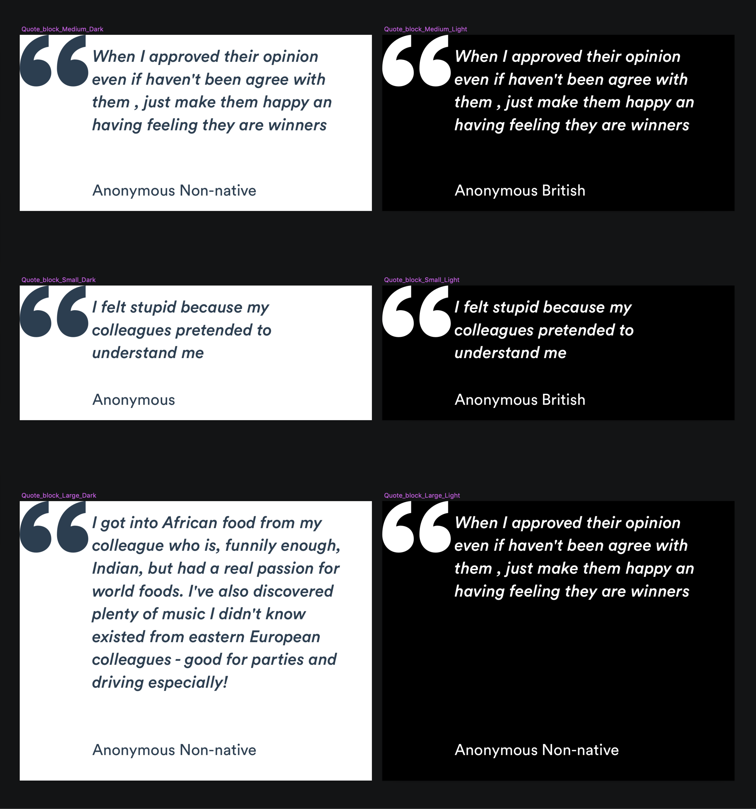
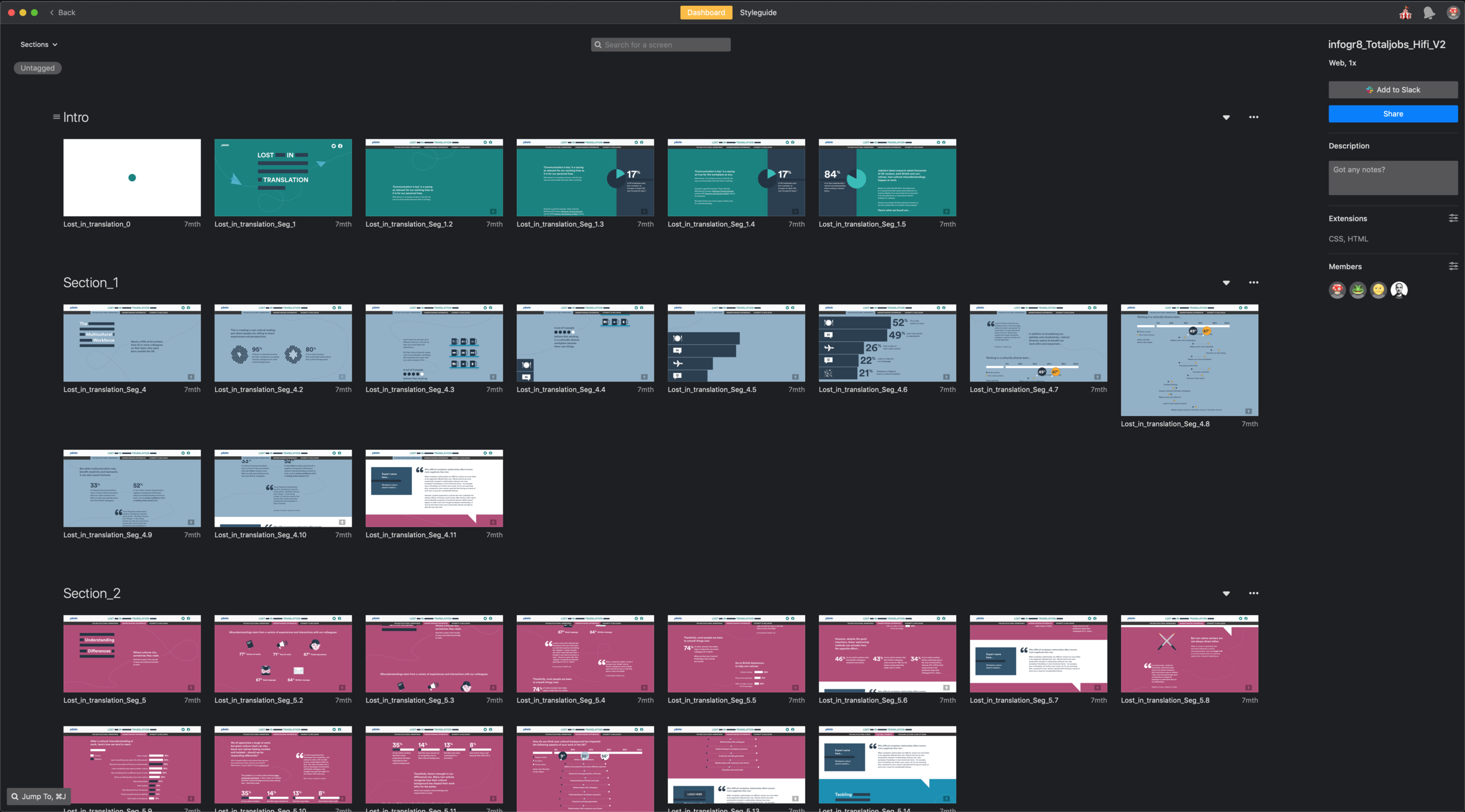
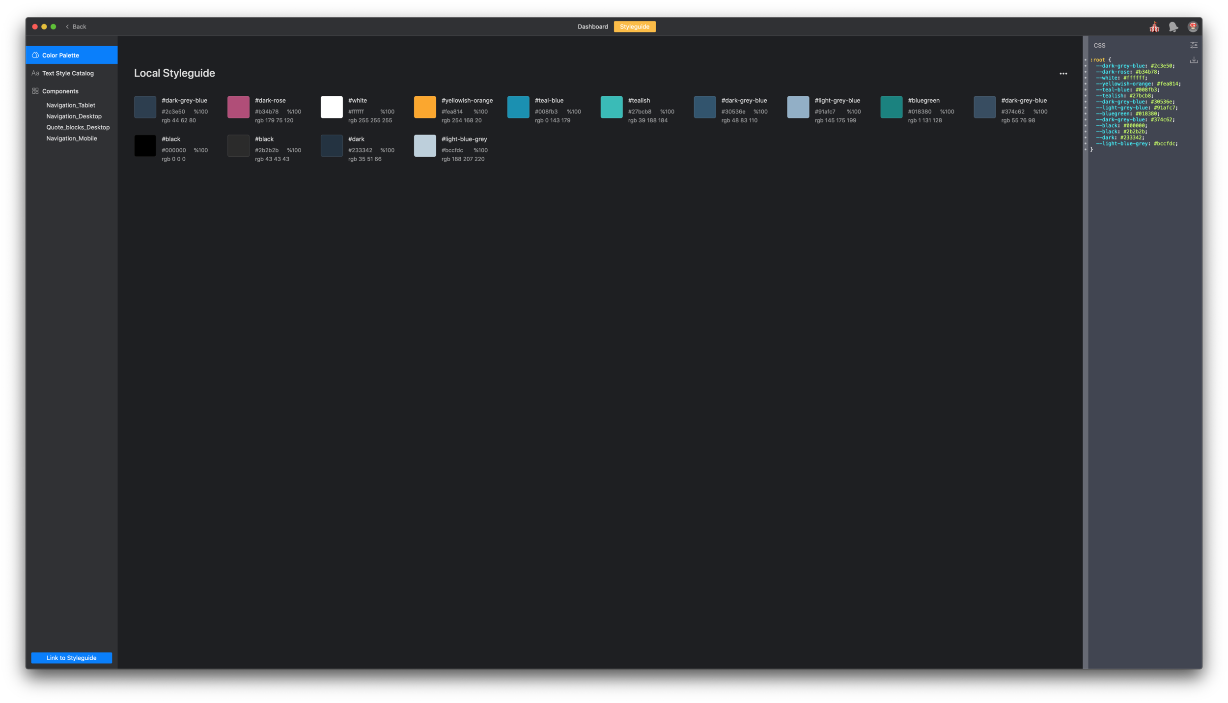
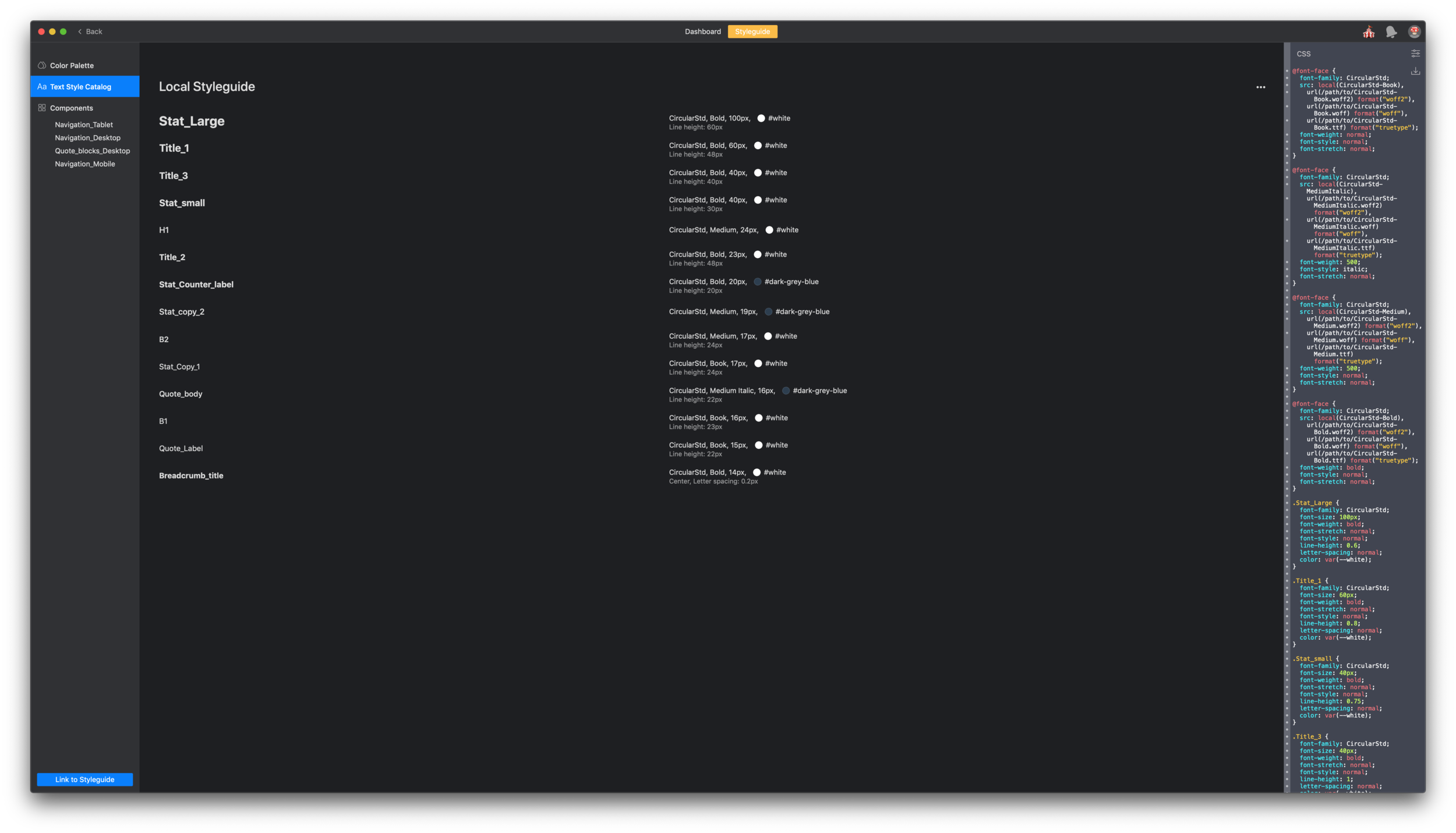
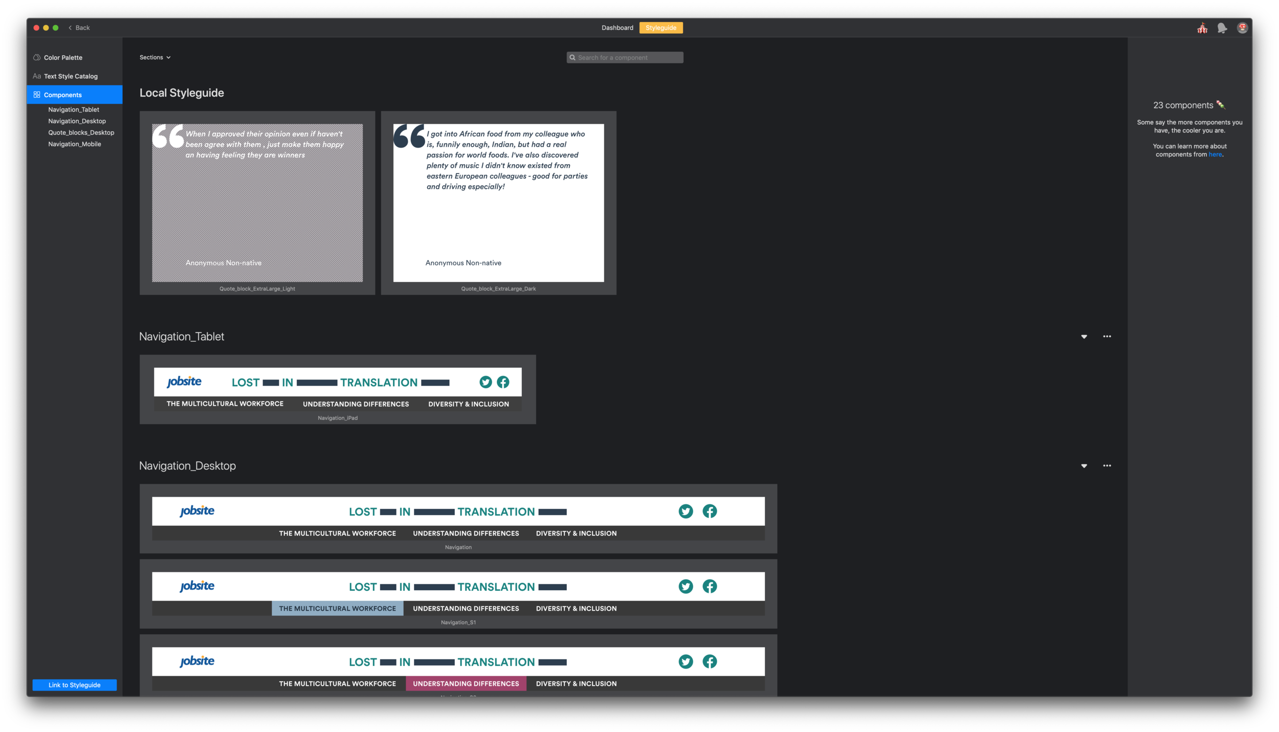
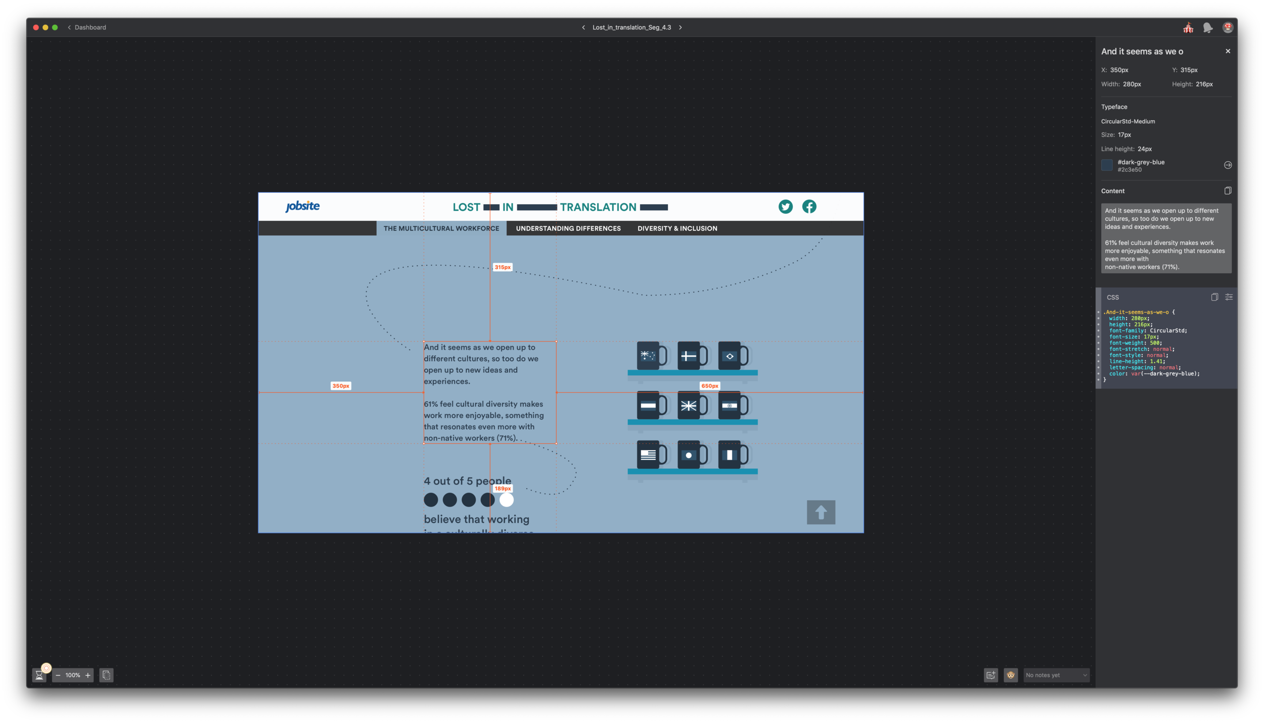
To get the right level of guidance from design, I have created symbol components in Sketch of the different UX elements that would help aid understanding of the states and journey in this product. I use Zeplin app to help me communicate effectively to the developers through the rest of the project in real time. It pings synced update via slack channels created for the project, so we are all up to date with the progress and managing feedbacks.
Gifing & Prototyping
I have considered the different touch points for this experience, maintaining interactivity within the animated information graphs that illustrates the data collected from research conducted survey, presented in an easy to explore format. I have used Principle app to create prototypes to guide the developer, gifs to be implemented in the experience and ultimately CSS animation where possible to keep the site light on loading.
Quality assurance &… launch!
Through the iterative development of the scrollable story, we embedded eureka moments that allows the user to interact with gestures such as clicking anywhere on screen to send a paper plane message flying digitally off screen. Utilising modular visual colour blocks to define a clear sign post for each section, with animated dotted lines that weaves into the various moments of cultural miscommunication in the workplace.


